20 Living Room Painting Ideas That Add Energy to Your Walls
Ignite your living room’s potential with 20 dynamic paint colors that transform boring walls into captivating focal points.
You’ve probably noticed how white walls can make your living room feel flat and uninspiring, but choosing the right paint color can completely alter your space’s energy and atmosphere. Bold blues create dramatic focal points, while earthy greens add unexpected warmth and sophistication to any décor style. The secret lies in understanding how different hues interact with your lighting, furniture, and personal style to create spaces that truly energize and inspire.
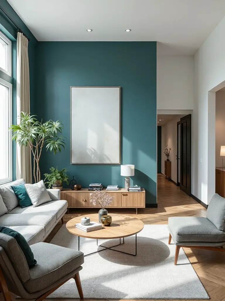
Bold Inky Blue Walls Create Electric Drama
When you’re looking to modify your living room into a dramatic showcase, bold inky blue walls can completely turn around your space’s energy and visual impact. Designer Heather French proves this with her electric Admiral Blue walls by Benjamin Moore, which create an almost luminous effect in her living room.
This bold color choice anchors heavily patterned spaces while providing essential grounding for eclectic furnishings and busy decor. The cocooning atmosphere makes your room feel inviting rather than overwhelming. You’ll find that deep inky blue serves as the perfect backdrop for mixing multiple patterns and creating sophisticated visual drama.
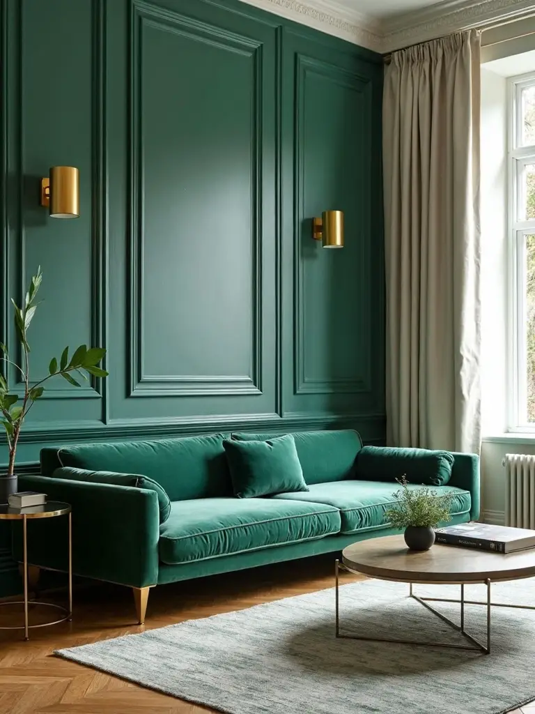
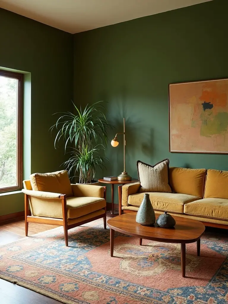
Kelly Green Acts as a Grounding Neutral
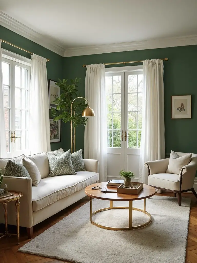
Although you might think Kelly green would overwhelm a living room, designer Hannah Ozburn demonstrates how this deep, rich hue actually functions as a sophisticated neutral in colorful spaces.
When you select this deeper wall color, you’ll create a grounding element that prevents your room from feeling chaotic or overwhelming. The Kelly green tone for your living room works beautifully as a backdrop for lively furnishings and eclectic decor pieces.
This approach allows you to incorporate bold patterns and bright accents while maintaining visual balance throughout your space.
Glossy Slate Blue Ceiling Makes a Statement
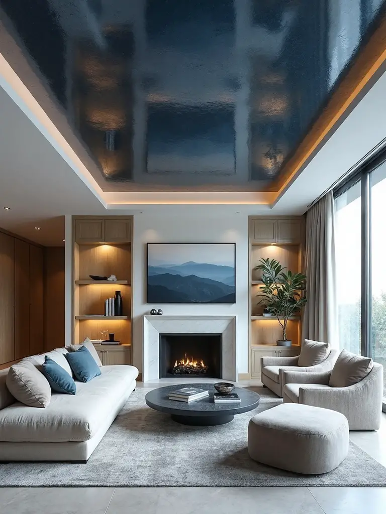
Most people automatically focus on wall colors when planning their living room makeover, but designer Suzanne Kasler proves that ceilings deserve equal attention with her bold choice of glossy Providence Blue by Benjamin Moore.
This slate blue color alters an ordinary wood-paneled room into something extraordinary by creating an unexpected focal point above. The glossy finish reflects light beautifully, adding depth and visual interest to the cozy space.
When you’re hesitant about painting entire walls, consider the ceiling as your canvas for bold color experimentation that’ll make a striking statement.
Chameleon-Like Steely Green Adapts to Any Style
Designer Serena Dugan demonstrates the power of adaptable color with her choice of Raindance by Benjamin Moore, a chameleon-like gray-green that metamorphoses based on your room’s lighting and furnishings.
This steely green hue shifts between cooler and warmer tones depending on what you pair it with. You’ll find it creates a calming atmosphere while remaining supremely flexible for any design approach.
The versatile shade complements everything from modern minimalist furniture to traditional pieces. Whether you’re working with bold accent colors or neutral palettes, this adaptable paint choice effortlessly bridges different styles and seasonal decor changes.
Mossy Green Transforms Rooms With Unexpected Warmth
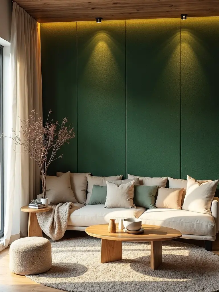
While mossy green might appear dull or unappealing when you’re examining paint swatches at the store, this earthy hue possesses extraordinary morphing abilities once it covers your living room walls. Designer Amber Lewis demonstrates this metamorphosis with Dunn-Edwards’ Elemental Green, which creates surprisingly warm and inviting atmospheres.
This chameleon-like color adapts to your furniture and decor, appearing warmer or cooler as needed. The mossy green tone pairs beautifully with natural materials and earthy accents, establishing a cozy environment that defies expectations. Don’t let that uninspiring swatch fool you—this sophisticated green alters ordinary spaces into welcoming retreats.
Cloudy Blue Opens Up Narrow Spaces
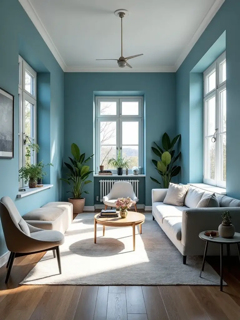
When designer Minnette Jackson faced the challenge of her long, narrow living room, she unearthed that cloudy blue paint could work visual magic on cramped quarters. This Pittsburgh Paints custom shade creates an elevated atmosphere that encourages relaxation while visually expanding tight spaces.
You’ll find that cooler-toned colors like cloudy blue make rooms feel more spacious by tricking the eye into perceiving greater depth. The serene quality of this hue boosts your narrow living area into a calming retreat.
Consider cloudy blue when you need to open up confined spaces while maintaining a sophisticated, inviting environment.
Delicate Pink Brings Spring-Inspired Vibrancy
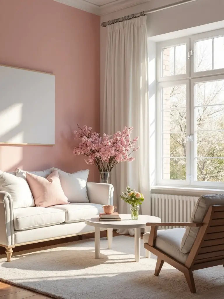
The delicate charm of soft pink paint revitalizes your living room into a spring-inspired sanctuary that radiates gentle warmth and lively energy. Colors like Farrow & Ball’s Tailor Tack capture the essence of cherry blossoms, infusing your room with uplifting femininity and comfort.
Designer Samantha Stathis Lynch successfully metamorphosed a colorful New York apartment using this approach, proving soft pink’s versatility as a sophisticated neutral. Unlike saturated alternatives, delicate pink encourages relaxation while maintaining vibrancy throughout your space.
This spring-inspired hue complements various design styles, creating an inviting atmosphere that feels both contemporary and timeless in any living room setting.
Rich Ochre Offers Cozy Yellow Without the Brightness
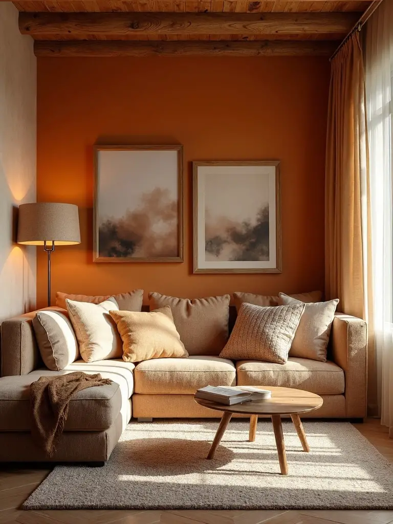
Sophisticated homeowners gravitate toward rich ochre paint when they crave yellow’s inherent warmth without its potentially overwhelming brightness and intensity. This deep, earthy shade alters your living space into a cozy retreat through its brown undertones that soften yellow’s natural vibrancy.
You’ll find ochre particularly effective in rooms with high ceilings or abundant natural light, where it creates an enveloping atmosphere. Pair these warm paint colors with natural textures like wood furniture, stone accents, and leather upholstery for maximum impact. Whether you paint all walls or create a single accent wall, ochre anchors pattern-filled rooms beautifully.
Deep Burgundy Adds Sophisticated Mahogany Tones
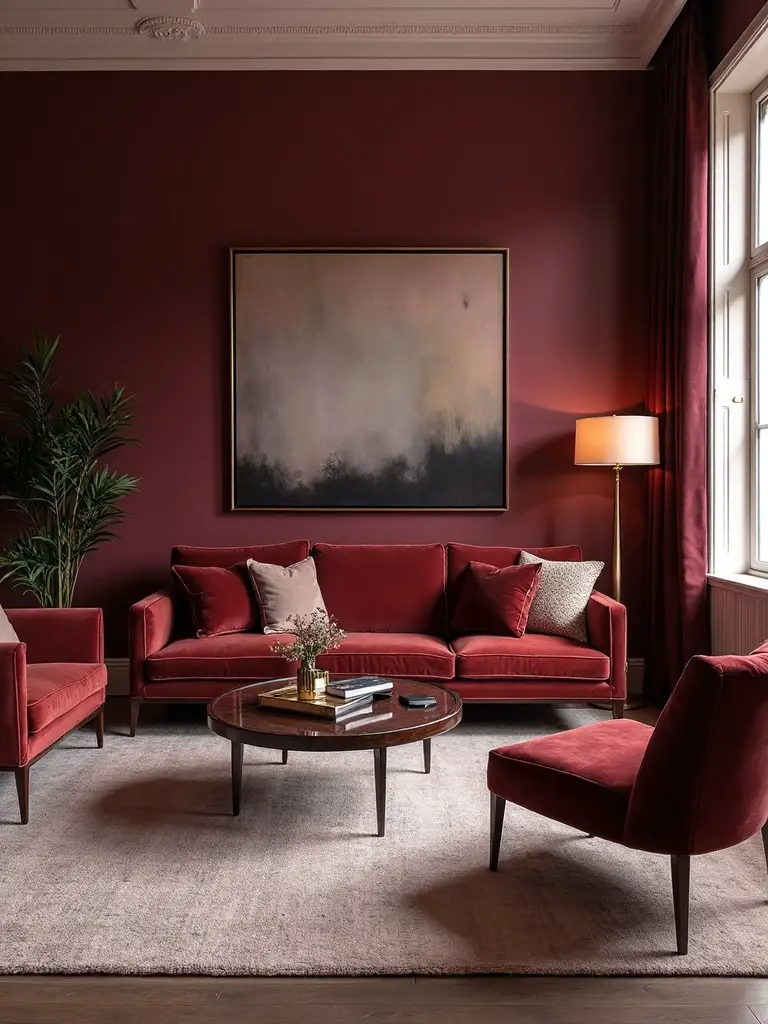
Although burgundy technically falls within the red-purple family, this rich paint color creates surprisingly sophisticated mahogany-like tones that enhance your living room into a refined sanctuary. Deep burgundy walls anchor your space with enveloping warmth while establishing an inviting foundation for various design styles.
You’ll find this versatile shade works seamlessly in both traditional and modern living room color schemes. The mahogany-like appearance provides warm and inviting ambiance without overwhelming brightness. Pair your burgundy walls with neutral furnishings and gold or brass accents to magnify the overall aesthetic and create a cozy yet sophisticated atmosphere.
Hague Blue Teal With White Ceilings Maximizes Height
Interior designer Jared Kuzia’s strategic choice of Hague Blue by Farrow & Ball demonstrates how deep teal walls can alter your living room’s perceived dimensions. You’ll create the illusion of taller ceilings by keeping them white while painting walls in this rich teal shade.
The contrast between deep walls and bright ceilings draws your eye upward, making rooms feel more spacious than they actually are. This Hague Blue selection provides a cocooning atmosphere that grounds your space without overwhelming it.
You’ll also highlight your home’s structural/building details while adding sophisticated depth through this bold color combination.
Soft Turquoise Elevates Coastal Design Elements
When designer Carmel Brantley selected Del Mar Blue by Benjamin Moore, she amplified a coastal living room into a refined sanctuary that captures ocean tranquility. This soft turquoise creates an enhanced atmosphere while pairing beautifully with patterned wallcoverings to establish cohesive coastal design throughout your space.
You’ll find soft turquoise particularly effective for evoking oceanic feelings that promote relaxation in your living room. The color’s calming properties work exceptionally well when you’re aiming to refine your coastal design aesthetic rather than simply decorating with beach themes. This approach demonstrates how thoughtful paint selection alters ordinary coastal elements into sophisticated design statements.
Avocado Green Preserves Midcentury Character
Moving from oceanic blues to earthy tones, Lisa Petrole, Magnolias Director of Styling, demonstrates how Savannah Shade by Benjamin Moore preserves authentic Midcentury character in historic living spaces. This versatile avocado green complements modern furniture silhouettes and graphic textiles while maintaining the era’s distinctive aesthetic.
You’ll find this warm hue works beautifully as a living wall color or strategic accent color throughout your space. The earthy tone creates an inviting atmosphere that bridges vintage and contemporary furnishings seamlessly. Choose Savannah Shade to honor your home’s Midcentury soul while adding sophisticated energy to tired walls.
Two-Tone Blue Plaster Creates Chic Contrast
Why settle for flat, monochromatic walls when you can create stunning visual depth with two-tone blue plaster? Designer Sara Prince demonstrates this technique perfectly in a children’s play area, where contrasting plaster hues enhance ordinary walls into sophisticated focal points.
The powder blue backdrop provides a soothing foundation while the secondary tone adds visual interest and contemporary appeal. This blue wall treatment works exceptionally well in living spaces, creating a chic contrast that boosts your room’s overall aesthetic.
You’ll achieve a modern, textured finish that brings both calming energy and stylish sophistication to your living room design.
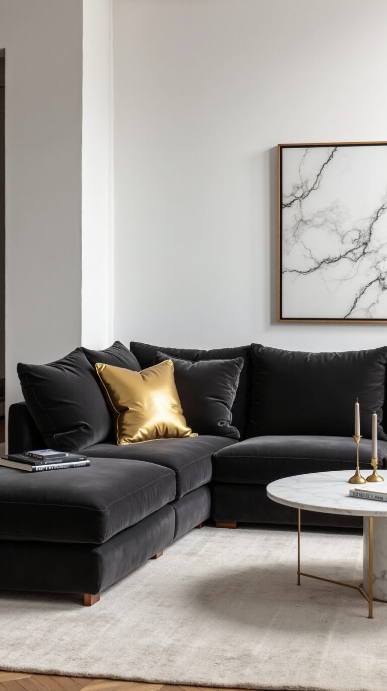
High-Gloss Black Heightens Art Deco Influence
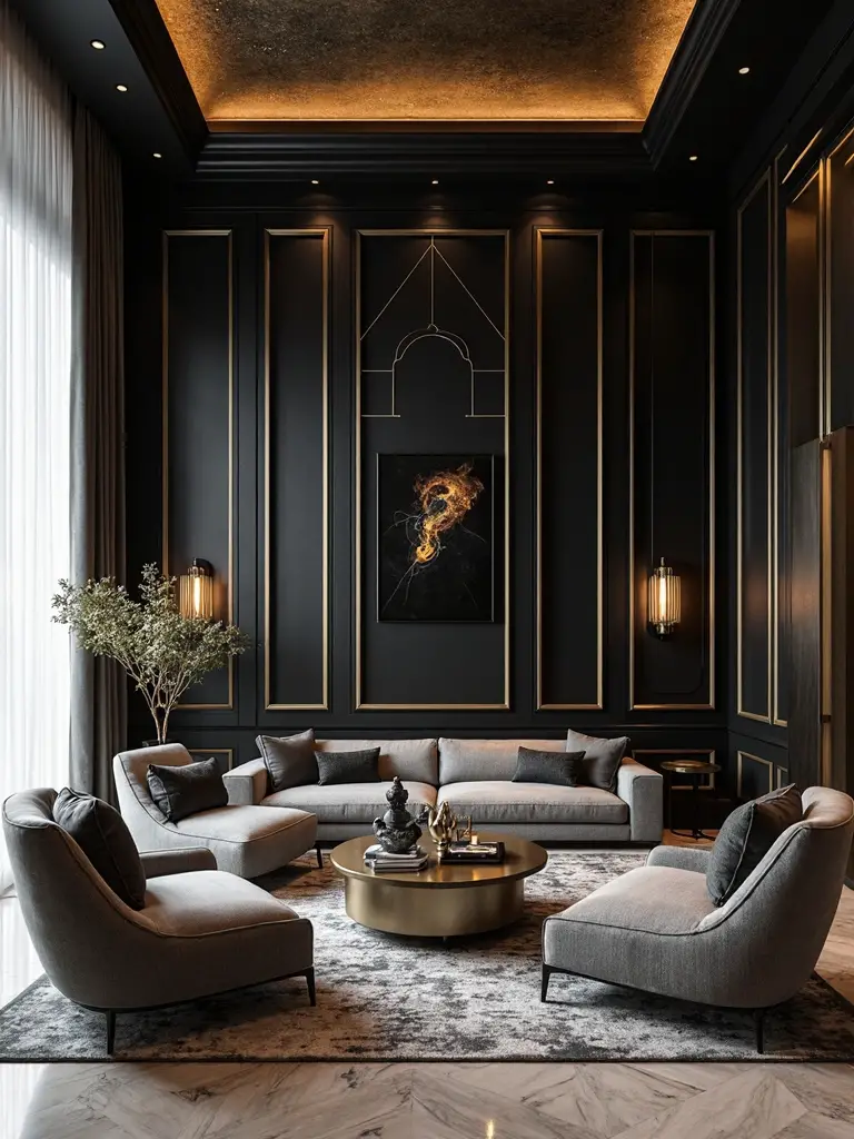
While soft blue tones create serene environments, bold high-gloss black walls deliver the ultimate dramatic statement for Art Deco enthusiasts. Designer Charlotte Lucas demonstrates how glossy black paint alters your living wall into a sophisticated backdrop that amplifies geometric patterns and metallic accents.
You’ll prevent overwhelming darkness by pairing high-gloss black walls with light-colored ceilings and lively furniture pieces. The reflective finish bounces light throughout the room, creating depth and visual interest.
This striking approach works best when you incorporate brass fixtures, jewel-toned accessories, and angular furniture that complement the dramatic aesthetic while maintaining balance in your space.
Sunny Yellow Promotes Happiness and Warmth
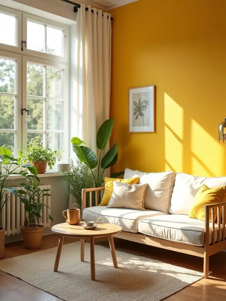
When you’re seeking to revitalize your living space into an uplifting sanctuary, sunny yellow paint delivers an instant mood enhancement that radiates throughout the entire room. Research confirms that yellow hues naturally promote cheerfulness, optimism, and sociability in your living room environment.
You’ll find that soft, muted yellows like buttercup create warm, inviting atmospheres, while lively canary shades energize spaces with vibrant punch. Balance your yellow walls by incorporating complementary cool tones such as blue and gray accents. This sunny color proves especially effective in north-facing living rooms that require additional brightness to combat natural light limitations.
Biophilic Soft Blues Establish Tranquil Atmospheres
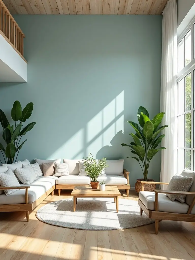
Soft blue paint colors offer a striking contrast to yellow’s energetic warmth by creating peaceful, nature-inspired living rooms that promote relaxation and mental clarity. These biophilic hues connect you directly to calming natural elements like sky and water. Consider Benjamin Moore’s Del Mar Blue for coastal-inspired spaces that enhance tranquility throughout your room.
You’ll find soft blue works beautifully as a backdrop, allowing patterned wallcoverings and artwork to stand out while maintaining serenity. Mix different shades from powder to periwinkle to establish cohesive harmony. This versatile color alters your living room into a restful retreat perfect for unwinding after busy days.
Lavender Purple Encourages Spiritual Transformation
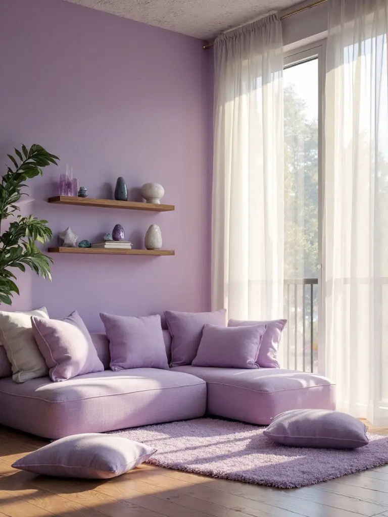
Beyond traditional wall colors, lavender purple alters your living room into a sanctuary that nurtures both spiritual growth and creative expression. This sophisticated shade modifies ordinary living rooms into reflective spaces that encourage personal breakthroughs and heightened awareness. You’ll find pastel lavender promotes introspection while deeper orchid tones inspire imagination and wisdom.
Lavender’s connection to colors associated with nature creates versatile decorating opportunities. You can pair it with cream accents for minimalist elegance or combine it with sage green for an earthy palette. The calming properties make it perfect for meditation corners or reading nooks where metamorphosis begins.
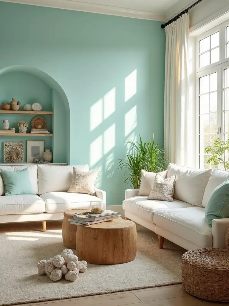
Mint and Sage Greens Connect Spaces to Nature
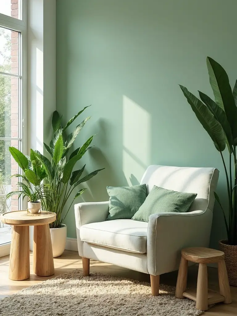
How can you instantly convert your living room into a peaceful retreat that feels connected to the outdoors? Choose mint green or sage green paint colors that are naturally associated with nature. These calming hues create an immediate sense of tranquility while bringing outdoor freshness indoors.
Mint green works exceptionally well in rooms with abundant natural light, reflecting brightness while maintaining serenity. Sage green offers deeper sophistication, perfect for creating cozy reading nooks or meditation corners. Both colors pair beautifully with natural wood furniture, stone accents, and botanical artwork, enhancing your space’s organic feel and promoting relaxation.
Warm Taupe Infuses Rooms With Subtle Comfort
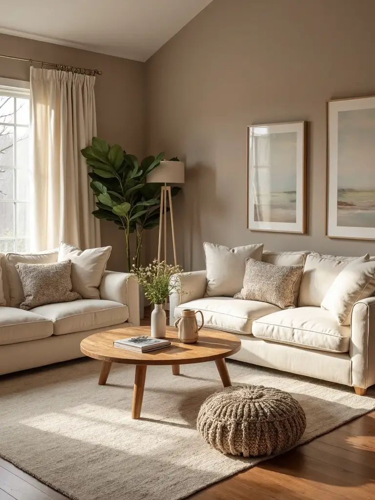
When you’re seeking a paint color that delivers warmth without overwhelming your living space, warm taupe creates the perfect basis for comfortable, inviting rooms. This versatile room paint color works beautifully with both modern and traditional furniture styles, offering sophisticated neutrality that won’t compete with your décor.
Warm taupe pairs exceptionally well with cream trim, creating subtle contrast that defines architectural elements without harsh shifts. You’ll find this cozy and inviting shade complements natural textures like woven baskets, leather furniture, and wooden accents perfectly. Consider deeper taupe tones for accent walls to add visual depth while maintaining your room’s serene atmosphere.
Energetic Citrus and Coral Combinations Spark Creativity
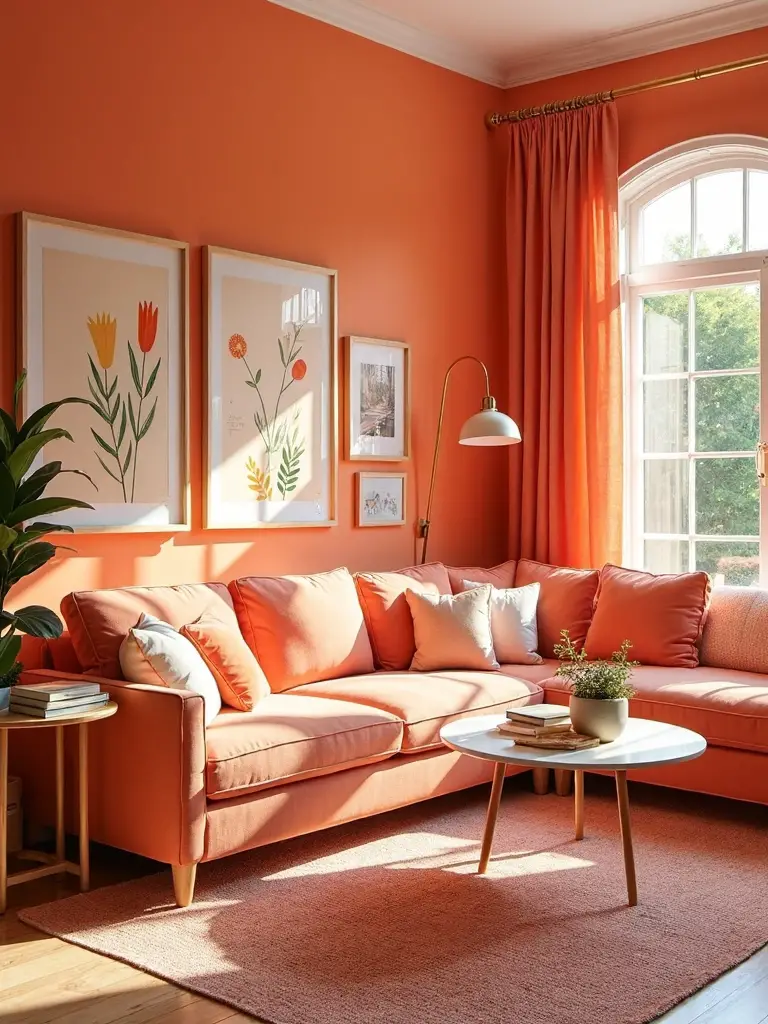
If you’re ready to alter your living room into an animated center that stimulates both mind and soul, citrus and coral combinations deliver the perfect lively solution. This energetic color palette metamorphoses your living space into a creativity-boosting environment that encourages conversation and engagement.
Combine citrus yellow, tangerine orange, and coral pink for maximum vibrancy. Use lemon, mandarin, and peach shades alongside saturated coral hues to create nature-inspired warmth. Position these bold colors against neutral white or gray backdrops, allowing the vivid tones to command attention and spark inspiration throughout your social living areas.
Conclusion
You’ve unearthed twenty powerful paint strategies that’ll metamorphose your living room from ordinary to extraordinary. Whether you choose dramatic inky blues, grounding kelly greens, or energizing citrus combinations, each color creates its own unique atmosphere. Don’t hesitate to experiment with unexpected ceiling treatments or bold accent walls. Your space deserves colors that reflect your personality while creating the alluring, fluid environment you’ll love coming home to every day.