Understanding Color Psychology for Designing Kids Bedrooms
Wondering how specific bedroom colors can scientifically boost your child’s sleep quality, learning ability, and emotional development through proven neurochemical responses?
You’re about to uncover how specific colors can alter your child’s bedroom into a scientifically-optimized space that supports their sleep, learning, and emotional well-being. The colors you choose aren’t just decorative decisions—they’re powerful tools that trigger measurable neurochemical responses in your child’s developing brain. From the calming blue that naturally lowers cortisol levels to the creativity-boosting yellow that enhances cognitive function, each hue serves a distinct biological purpose that directly impacts your child’s daily experience and development.
The Science Behind Color Psychology in Child Development
When you’re selecting colors for your child’s bedroom, you’re actually influencing their brain development in measurable ways. Research shows that specific hues trigger neurochemical responses that directly impact emotional development and learning capacity.
Cool blues and greens activate your child’s parasympathetic nervous system, promoting calmness and better sleep quality. Warm yellows and oranges stimulate cognitive functions, enhancing focus and creativity during play activities.
Red increases arousal levels, which can heighten energy but may disrupt rest periods. Purple combines cognitive stimulation with emotional balance, making it ideal for study areas within bedrooms.
Understanding these scientific connections helps you create environments that support your child’s prime growth.
How Colors Affect Sleep Patterns and Rest Quality
Your child’s bedroom color palette directly controls their circadian rhythm, the internal clock that regulates sleep-wake cycles throughout each 24-hour period. Blue and green tones naturally promote melatonin production, helping children fall asleep faster and achieve deeper rest phases. These cool colors reduce cortisol levels while supporting natural drowsiness signals.
Circadian rhythm factors include color temperature and saturation intensity in your child’s sleeping environment. Light exposure effects from bright reds or oranges can delay sleep onset by up to 45 minutes. You’ll want to choose muted, calming shades that work with your child’s biology rather than against it for ideal rest quality.
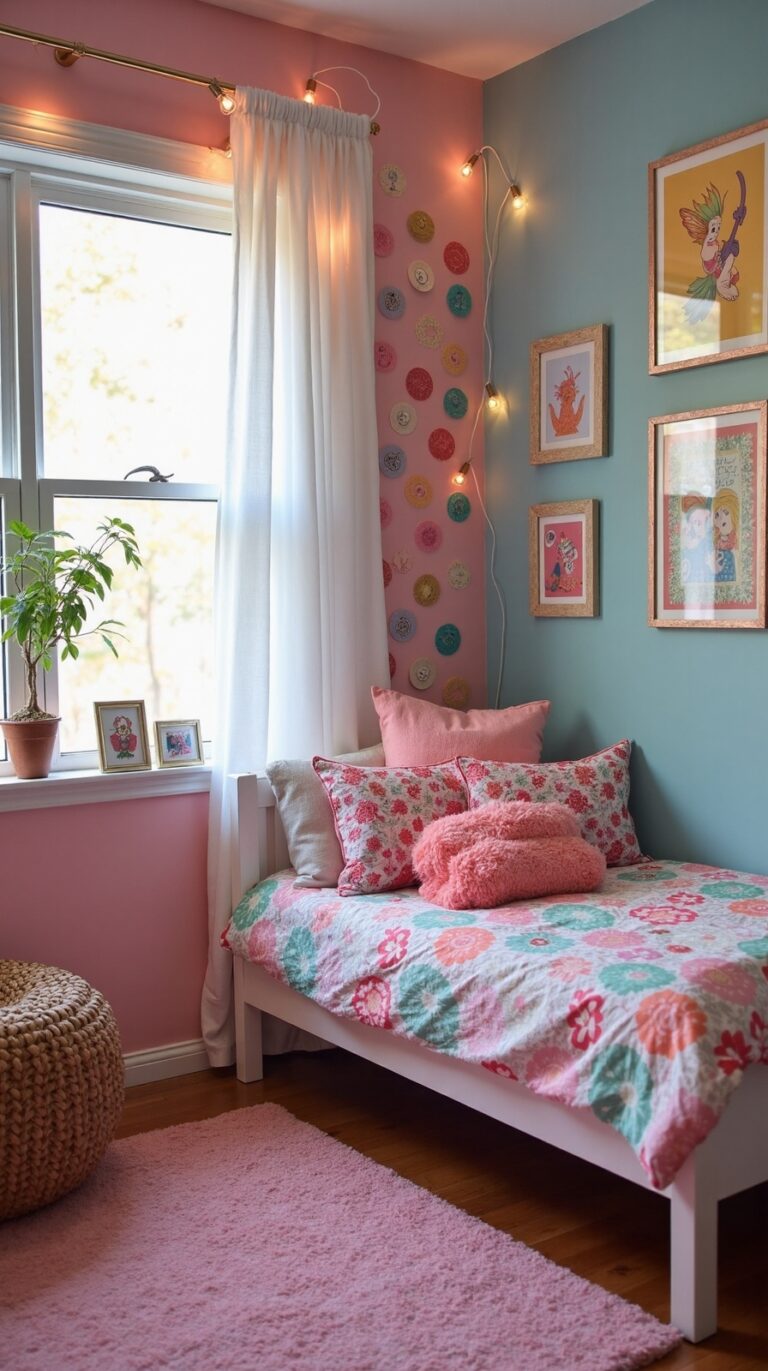
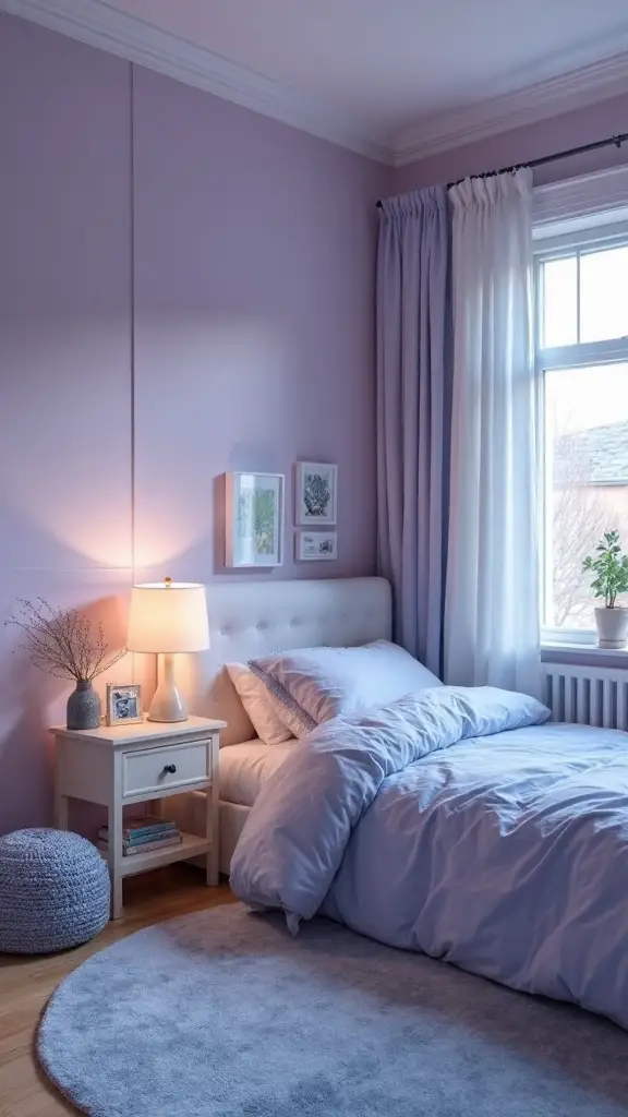
Blue Tones: Creating Calm and Peaceful Environments
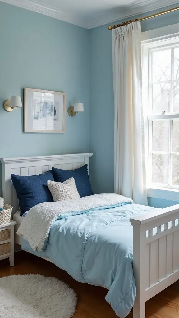
Blue stands as the most scientifically-backed color choice for children’s bedrooms, offering measurable benefits that extend far beyond simple aesthetics. You’ll find that soft blue shades naturally lower heart rate and blood pressure, making bedtime routines smoother.
Light powder blues create a serene ambiance that encourages relaxation, while deeper navy accents add sophistication without overstimulation.
Consider pairing pale blue walls with white trim for maximum calming effect. You can incorporate blue through bedding, curtains, or wall decals if painting isn’t possible. This tranquil atmosphere helps children move from active play to restful sleep more easily.
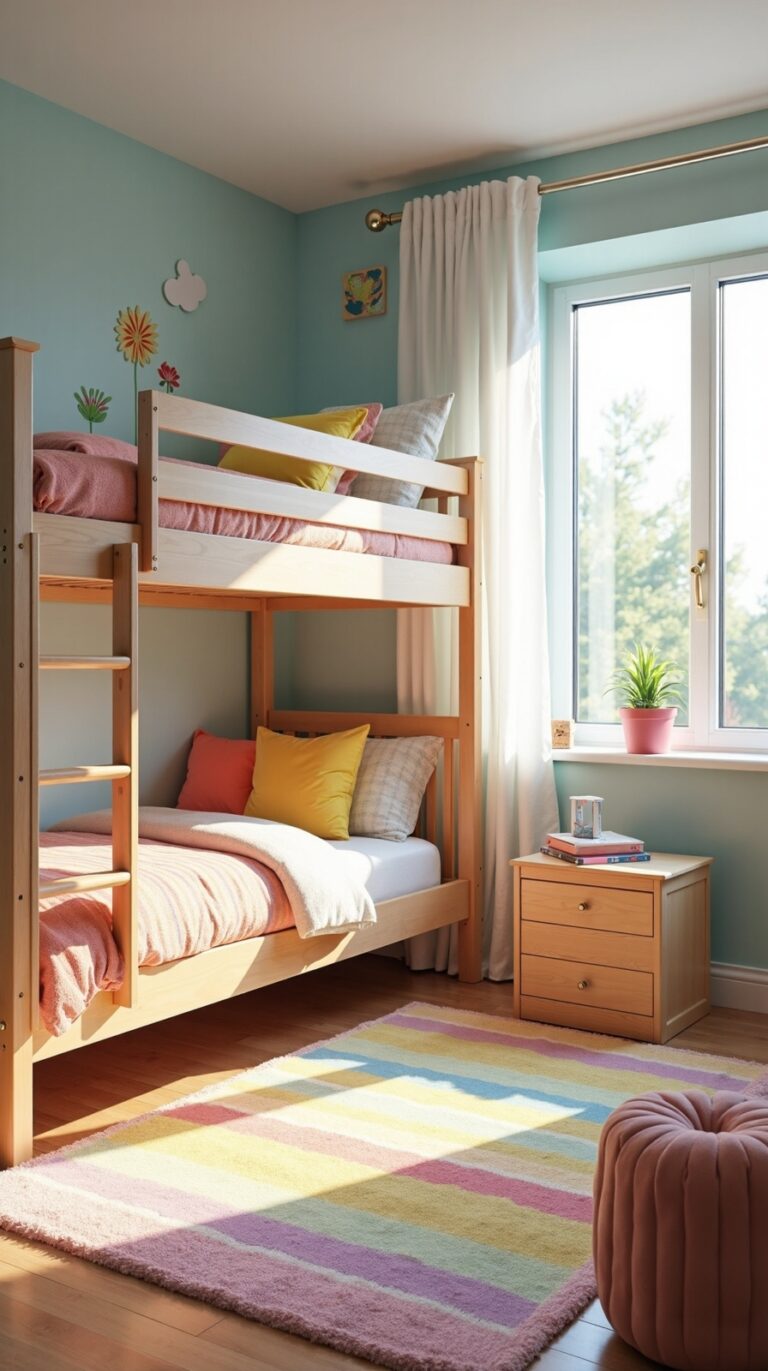
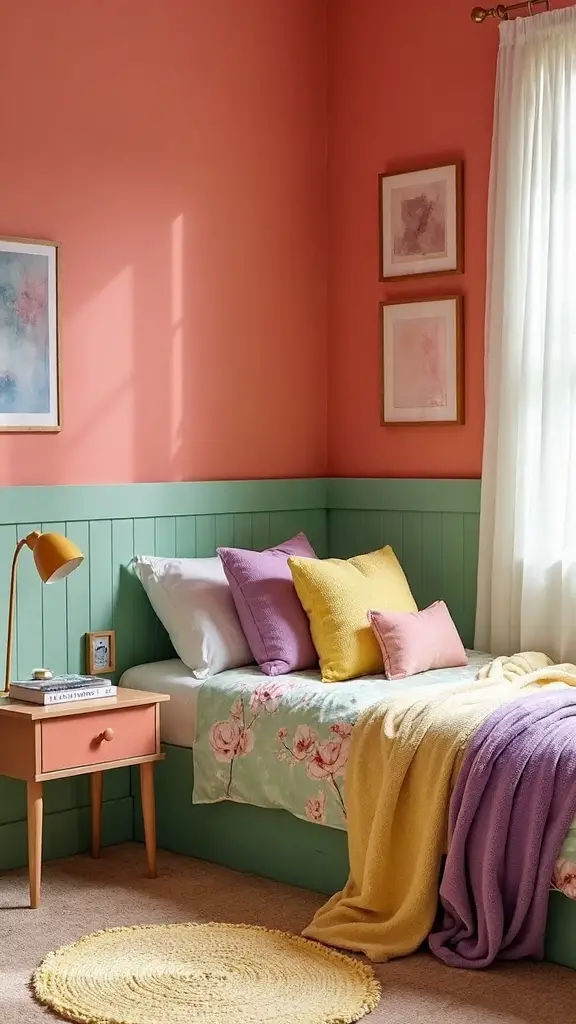
Green Hues: Promoting Balance and Concentration
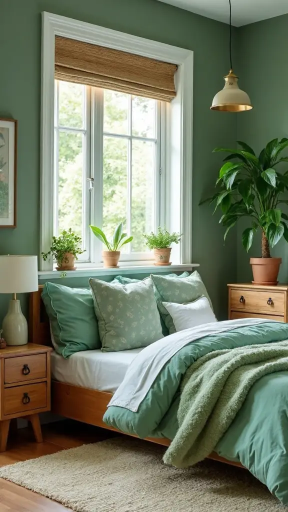
Drawing from nature’s most abundant color, green alters children’s bedrooms into balanced sanctuaries that enhance both focus and tranquility. You’ll find that sage, forest, and mint greens create environments supporting cognitive development while reducing overstimulation.
These versatile hues work exceptionally well in study areas, promoting sustained attention during homework sessions.
Incorporate natural elements like wooden furniture, bamboo accessories, or leaf-patterned textiles to amplify green’s calming effects. Pair lighter greens with cream accents for younger children, or combine deeper emerald tones with gold highlights for teens. You can use green as an accent wall behind desks to bolster concentration.
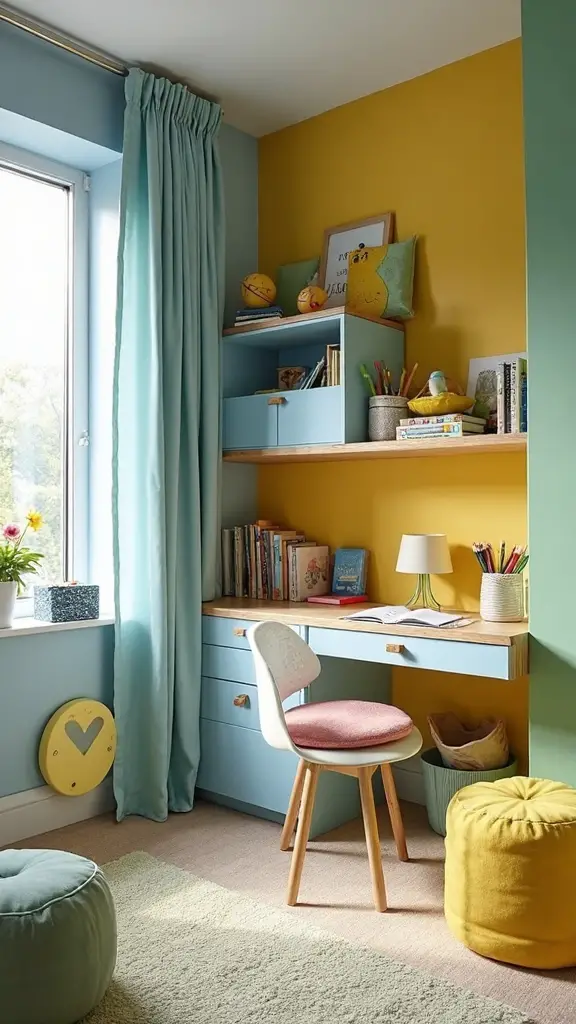
Yellow Shades: Stimulating Creativity and Learning
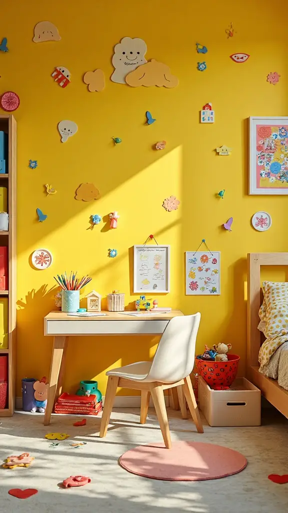
While green provides the perfect foundation for focused learning spaces, yellow shades energize children’s bedrooms with warmth and intellectual stimulation that sparks creative thinking. You’ll find that soft buttery yellows work beautifully on accent walls, creating cozy reading nooks without overwhelming the space.
Consider incorporating lively shades through artwork, throw pillows, or desk accessories to maintain visual interest. Pair yellow with neutral whites or grays to prevent overstimulation during sleep hours. Add playful accents like yellow bookends, lamp shades, or storage bins to encourage organization while supporting your child’s natural curiosity and learning development.
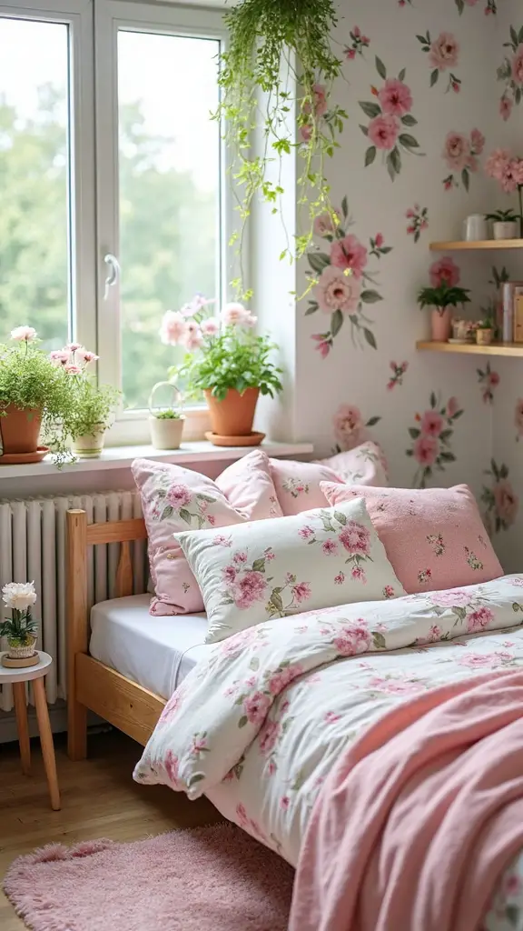
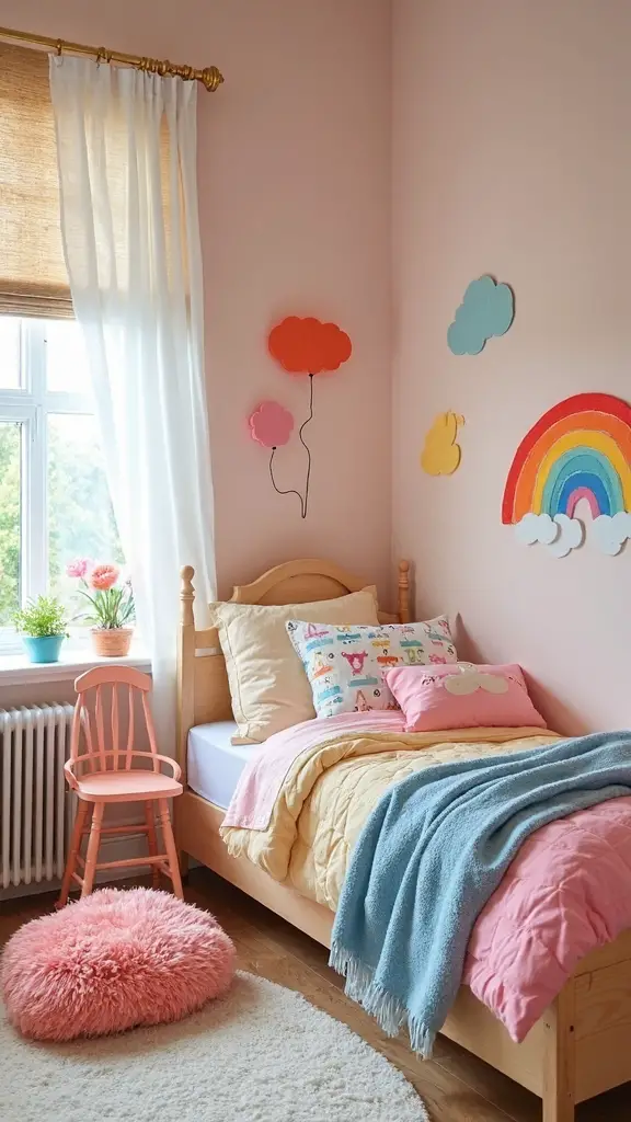
Pink and Purple: Gender Considerations and Emotional Impact
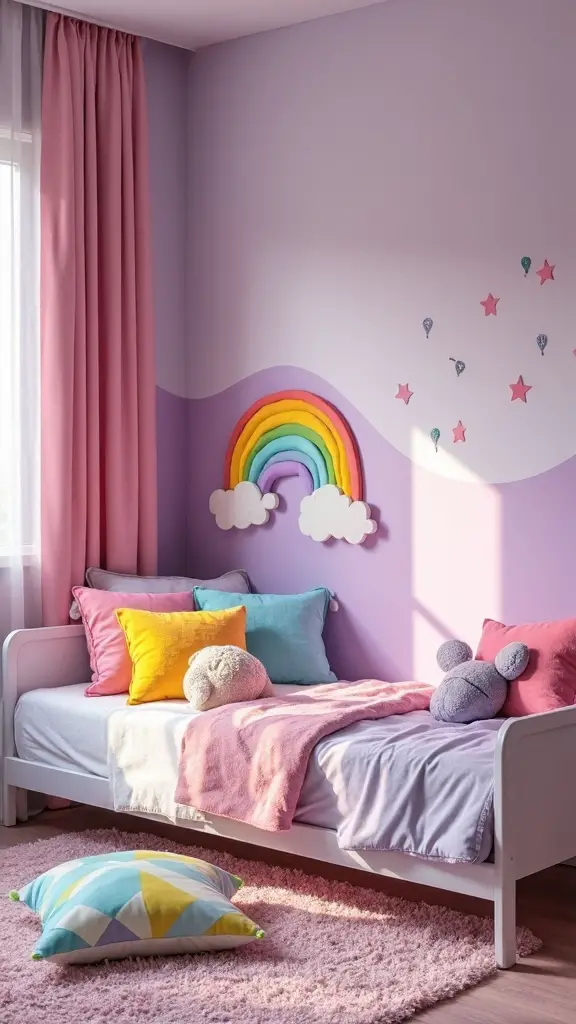
Two colors that spark passionate debates among parents and designers are pink and purple, each carrying complex emotional associations that extend far beyond traditional gender stereotypes. You’ll find these hues offer powerful benefits when used thoughtfully in children’s spaces.
Pink promotes emotional expression through color by encouraging nurturing behaviors and creating calming environments. Purple stimulates imagination while cultivating creativity and confidence in all children.
Challenge gendered color associations by incorporating these shades strategically. Use soft lavender for peaceful sleep zones or lively magenta accent walls for energizing play areas. Remember, any child can benefit from pink’s soothing qualities or purple’s inspiring effects regardless of gender.
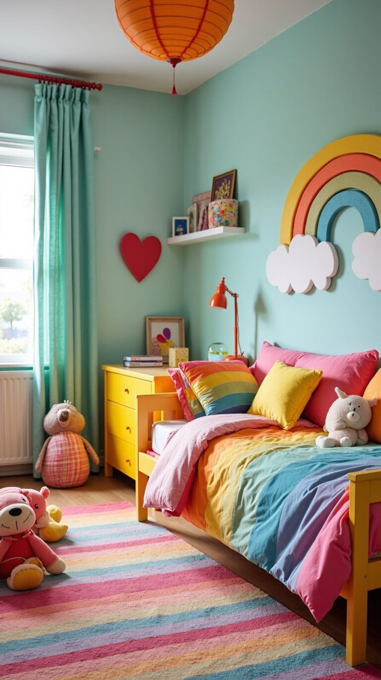
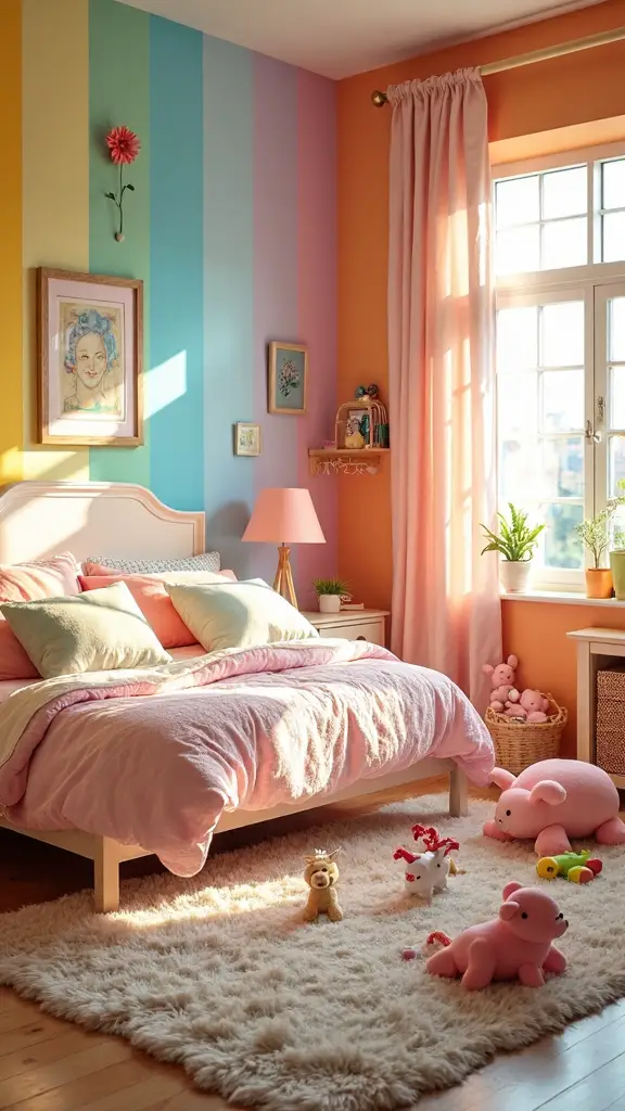
Red and Orange: Managing Energy and Stimulation Levels
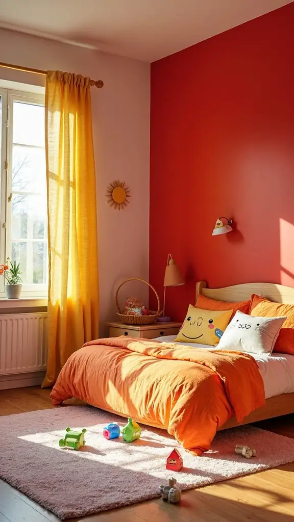
Bold and energetic colors like red and orange create dramatic visual impact in children’s bedrooms, yet they require careful consideration due to their powerful psychological effects.
These warm hues excel at energizing moods and promoting activity, making them perfect for play areas or accent walls. However, you’ll want to avoid overstimulating effects that can interfere with sleep quality.
Consider using red and orange strategically through accessories, artwork, or single feature walls rather than dominant room schemes. Balance these intense colors with calming neutrals like white or soft gray to create visual breathing space and promote restful sleep.
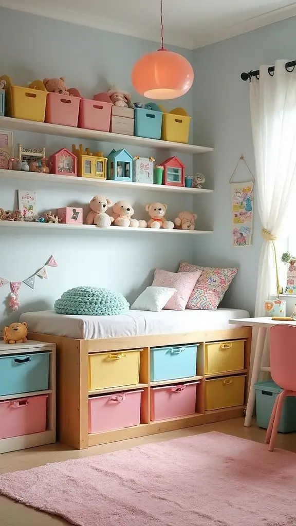
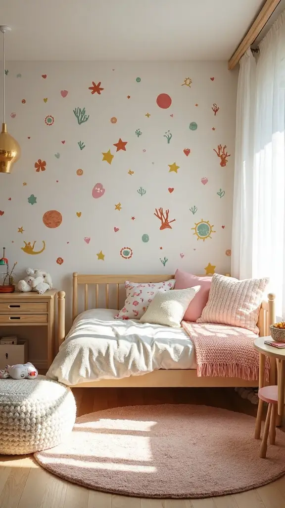
Neutral Colors: Building Versatile and Timeless Spaces
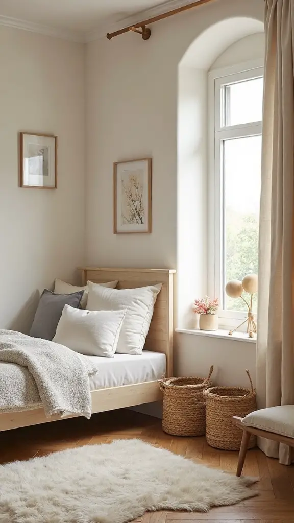
Neutral colors create the foundation for children’s bedrooms that adapt seamlessly to changing preferences and growing personalities over time. You’ll find that beiges, grays, and whites provide flexibility for adding colorful accessories without overwhelming the space. These timeless shades support a minimalist aesthetic that grows with your child from toddler to teenager.
Earthy tones like warm taupe and soft cream offer comfort while remaining gender-neutral and age-appropriate. You can easily update the room’s personality through bedding, artwork, and decorative elements. This approach saves money on future redecorating while creating a calming environment that promotes better sleep and concentration.
Age-Appropriate Color Choices From Toddlers to Teens
As children develop through different stages, their color preferences and psychological responses to various hues shift dramatically, requiring thoughtful consideration when selecting bedroom palettes.
Toddlers thrive with bright, stimulating colors like sunshine yellow and grass green, often paired with playful patterns featuring animals or simple shapes. School-age children benefit from balanced combinations that support both energy and focus, such as soft blues with lively accent walls. Teenagers prefer sophisticated schemes reflecting their emerging identity—deep purples, forest greens, or monochromatic grays.
Understanding color significance at each developmental stage helps you create spaces that grow with your child’s changing needs.
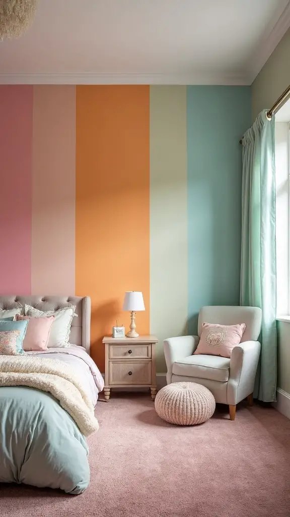
Combining Colors Effectively for Optimal Results
Three fundamental principles guide successful color combinations in children’s bedrooms: balance, harmony, and functionality. Start with a dominant neutral base like soft gray or cream, then add two complementary accent colors. This creates visual balance without overwhelming the space.
For color harmony, use the 60-30-10 rule: 60% neutral base, 30% primary accent, and 10% bold secondary color. Cool blues paired with warm yellows create energizing contrast, while analogous colors like blue-green combinations promote tranquility.
Test combinations with paint samples first, considering how natural and artificial lighting affects each hue throughout the day.
Practical Tips for Implementing Color Psychology in Room Design
Color psychology becomes actionable when you understand how specific hues directly impact your child’s daily activities and emotional well-being. Start by identifying your child’s primary needs: relaxation, focus, or energy stimulation. Choose dominant colors based on these psychological associations—soft blues for better sleep, warm yellows for creativity, or gentle greens for balance.
Create color harmony by following the 60-30-10 rule: sixty percent neutral base, thirty percent secondary color, and ten percent accent hues. Test paint samples in different lighting conditions before committing. Consider your child’s age-specific responses to colors, as preferences and psychological reactions evolve with development.
Conclusion
You now possess the knowledge to convert your child’s bedroom into a scientifically-backed sanctuary that promotes healthy sleep, enhanced learning, and emotional well-being. Start by selecting age-appropriate base colors, then layer complementary hues strategically throughout the space. Remember that small changes create significant impacts—you don’t need complete renovations to utilize color psychology’s benefits. Trust the science, observe your child’s responses, and adjust accordingly for ideal developmental support.