13 Beautiful Small Living Room Paint Color Ideas That Open Up Your Space
Small living rooms transform dramatically with these 13 stunning paint colors that create visual magic, but one unexpected shade will completely revolutionize your space.
You’re staring at your cramped living room walls, wondering how paint alone could possibly make this space feel bigger. The truth is, choosing the right color can dramatically alter your small room’s visual dimensions, creating an airy openness that seems almost magical. These thirteen carefully selected paint colors work with light and shadow to expand your space beyond its physical boundaries. Each option offers unique benefits that’ll astound you with their space-enhancing power.
Classic White: The Ultimate Space Expander
When you’re working with a cramped living room, classic white paint remains the most reliable solution for creating an illusion of spaciousness. You’ll uncover that white walls reflect natural light throughout your room, instantly making it feel larger and more open than darker alternatives.
The timeless appeal of white paint means you won’t need frequent updates, giving you the freedom to experiment with colorful furniture and accessories instead. You can choose from various white shades like warm ivory, crisp pure white, or soft off-white to match your style preferences.
White’s versatile application works with any décor theme, from modern minimalism to cozy farmhouse. You’ll find that white walls create a clean backdrop that lets your personality shine through artwork, textiles, and decorative pieces. Consider incorporating wall decor ideas that complement your white walls to further enhance the inviting atmosphere of your small space.
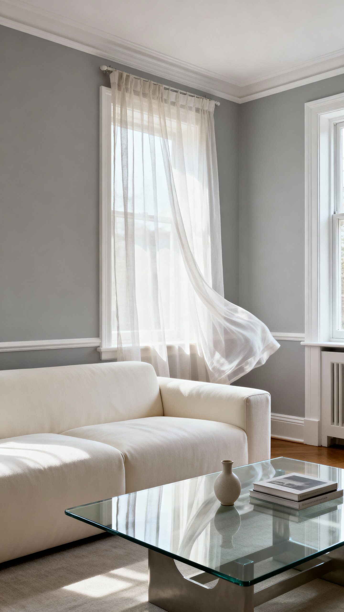
Soft Gray: Modern Sophistication That Breathes
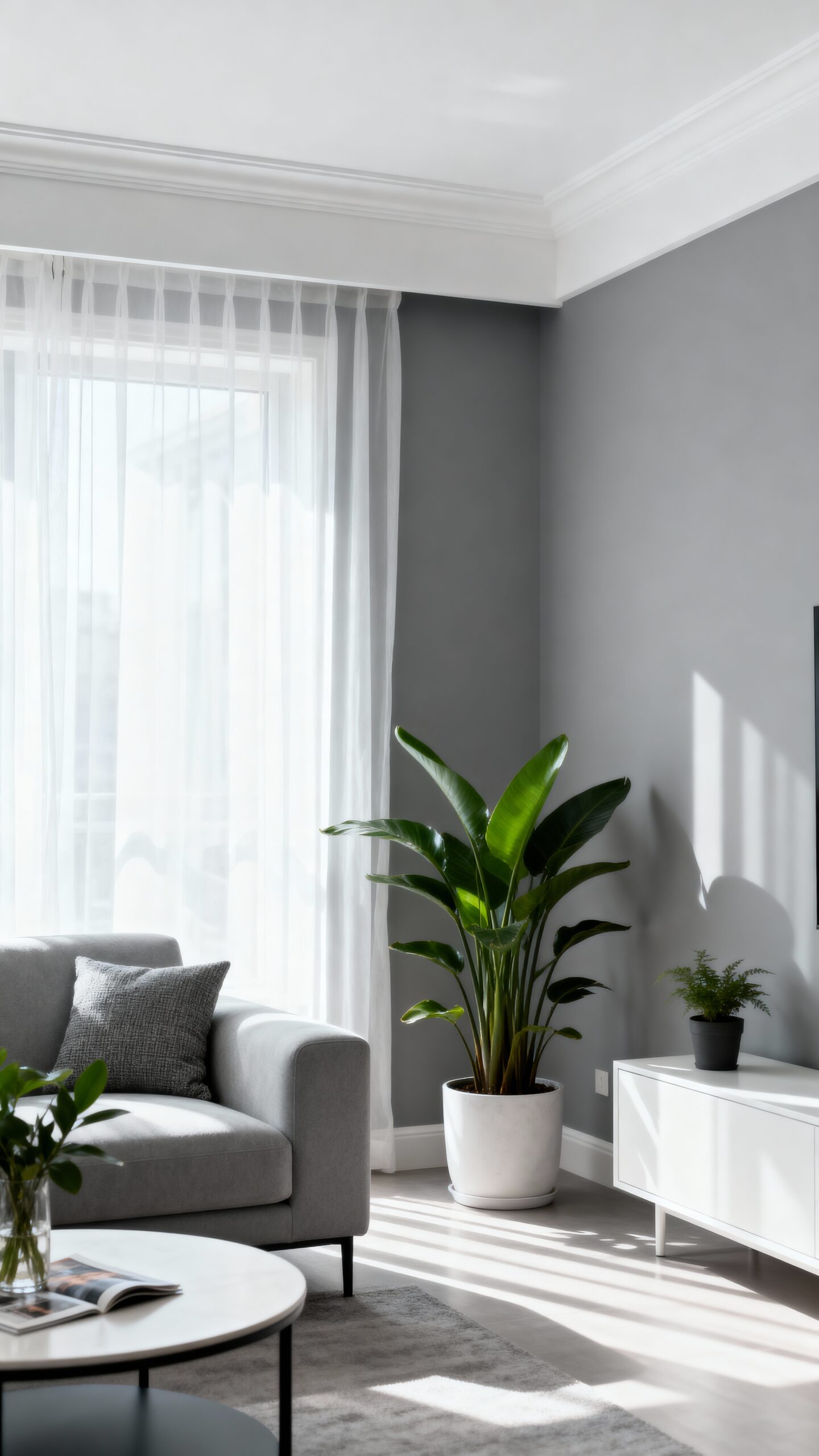
While white paint offers unmatched brightness, soft gray provides the perfect middle ground between dramatic color and neutral sophistication for your small living room. You’ll uncover that light gray shades like “Agreeable Gray” or “Classic Gray” create moody elegance without overwhelming your space.
Gray’s timeless appeal works beautifully with both warm and cool accent colors, giving you decorating freedom that white can’t match. You can pair soft gray walls with crisp white trim to maintain that spacious feeling while adding visual interest. Consider selecting charming chair designs that complement your gray palette while maximizing functionality in your compact space.
Choose cooler gray tones with blue undertones for north-facing rooms, or warmer grays with beige undertones for south-facing spaces. This sophisticated neutral reflects light effectively while providing enough depth to make your small living room feel intentionally designed rather than simply painted.
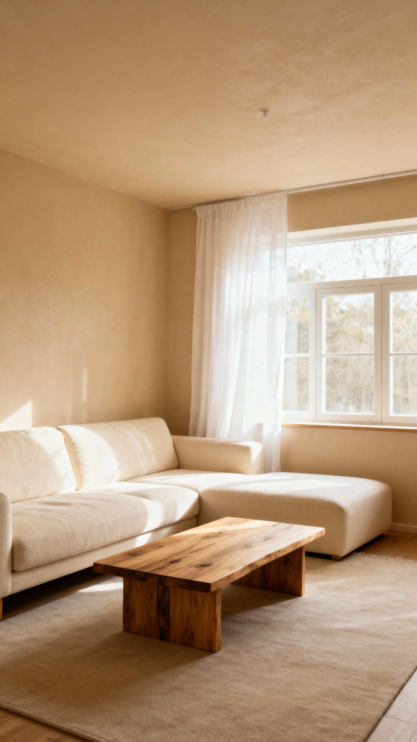
Creamy Off-White: Warmth Without the Weight
If stark white feels too clinical and gray seems too cool, creamy off-white delivers the perfect balance of brightness and subtle warmth for your small living room. This versatile shade creates an inviting atmosphere while maintaining the spacious feel you’re after.
Creamy off-white’s light reflecting properties bounce natural light throughout your room, making walls appear to recede and ceilings seem higher. The creamy texture adds visual depth without overwhelming your space, giving you freedom to experiment with bold accent colors through furniture and artwork. To maximize your room’s potential, pair this paint choice with furniture featuring clean lines that won’t compete with your walls for visual attention.
Choose shades like Benjamin Moore’s Cloud White or Sherwin-Williams’ Creamy for foolproof results. These colors work beautifully with both warm wood tones and cool metal finishes, letting you change your décor seasonally without repainting. You’ll enjoy a bright, airy space that feels genuinely welcoming.
Pale Blue: Sky-Like Serenity for Visual Height
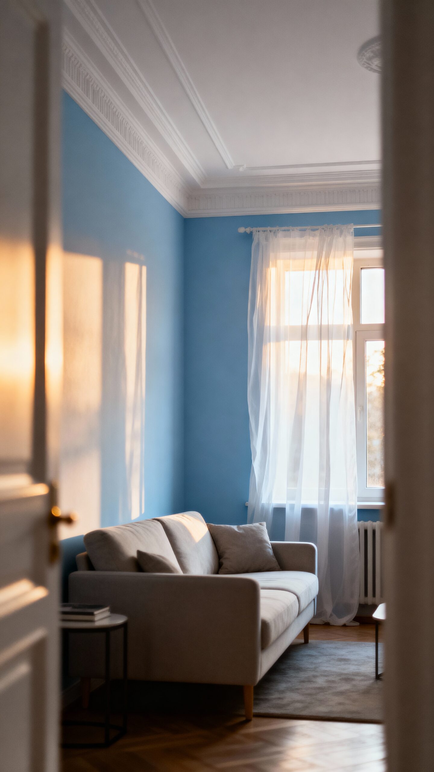
Cool colors naturally create the illusion of distance, making pale blue an exceptional choice for expanding your small living room’s visual boundaries. This sky-inspired hue mimics the endless horizon, tricking your eye into perceiving greater depth and height than actually exists.
Choose powder blue or soft periwinkle to achieve maximum calming stillness without overwhelming your compact space. These gentle tones reflect light beautifully while maintaining the airy openness you’re seeking. You’ll find pale blue works particularly well on accent walls behind sofas or entertainment centers.
Pair your pale blue walls with crisp white trim and light-colored furniture to amplify the spacious effect. For those drawn to minimalist design, pale blue provides the perfect foundation for clean lines and uncluttered aesthetics. Add navy or deeper blue accessories for subtle contrast without breaking the color harmony that makes your room feel infinitely larger.
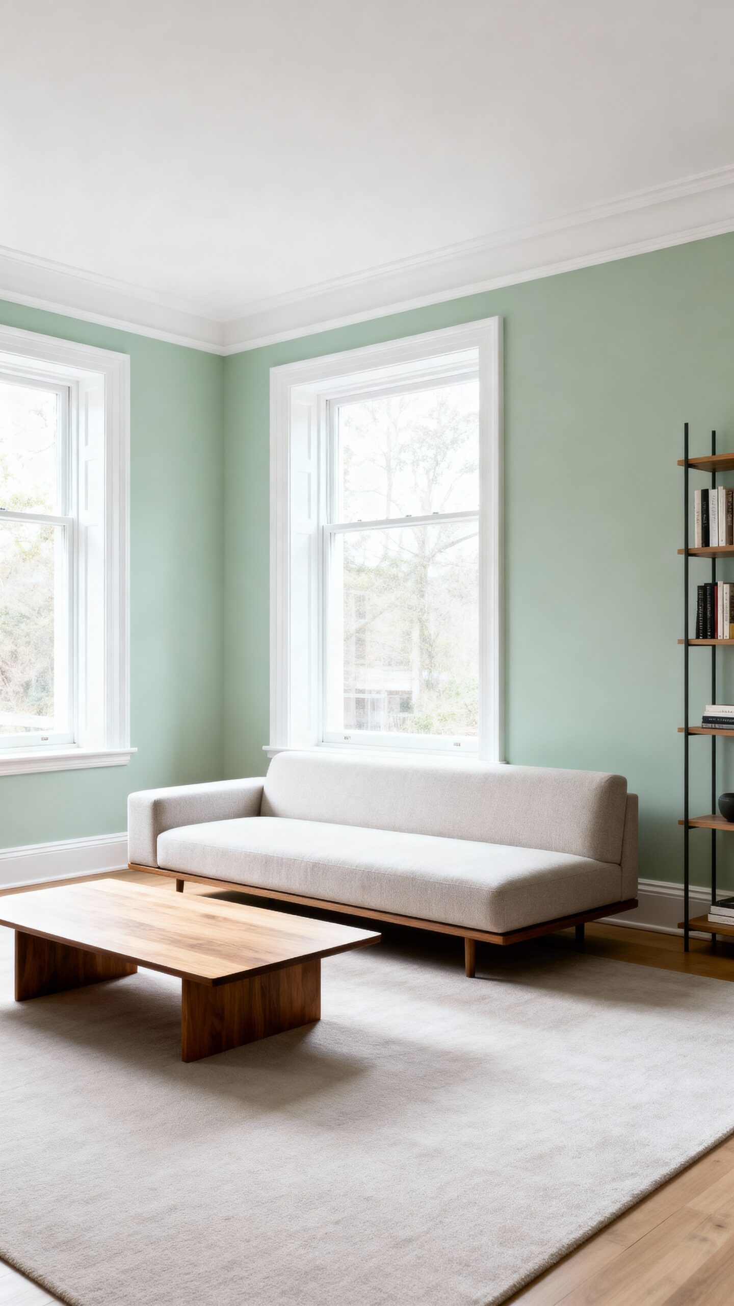
Light Sage Green: Nature-Inspired Tranquility
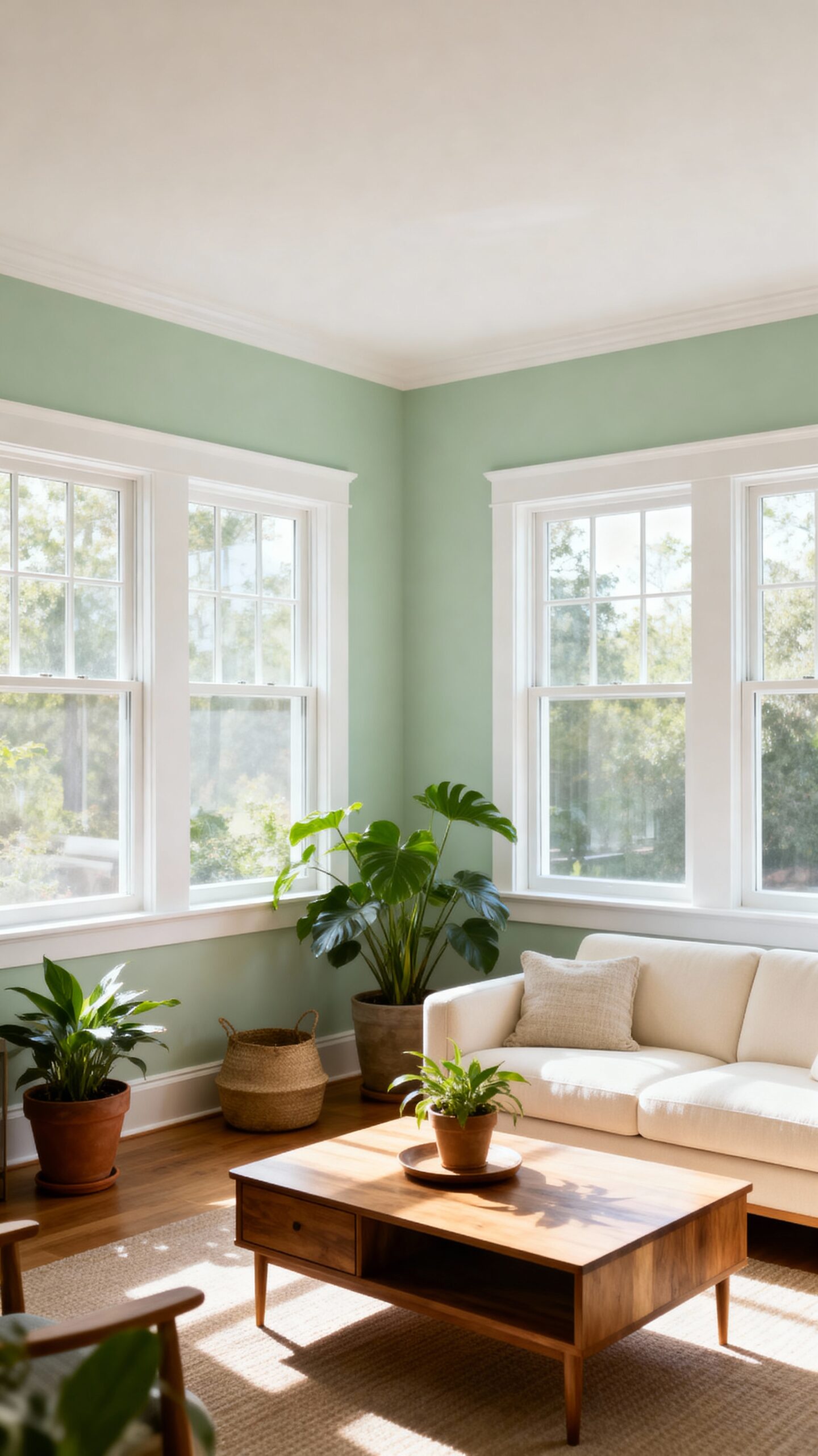
Because sage green draws its inspiration directly from nature’s most calming elements, this versatile hue alters your small living room into a peaceful retreat that feels both grounded and spacious. You’ll uncover that light sage green creates a soothing ambiance that doesn’t overwhelm your compact space while maintaining visual interest.
This earthy tone works exceptionally well with natural materials like bamboo furniture, jute rugs, and wooden accents. You can pair it with crisp whites for contrast or warm beiges for a harmonious nature-inspired palette. The color’s subtle gray undertones prevent it from appearing too bold while still providing personality.
Consider using light sage green on an accent wall behind your sofa or throughout the entire room for maximum impact and tranquility. For those drawn to Western-style decor, light sage green provides the perfect backdrop for rustic leather furniture and weathered wood elements that create an inviting, cozy atmosphere.
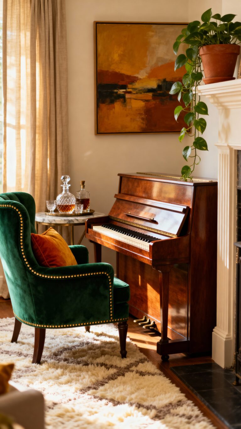
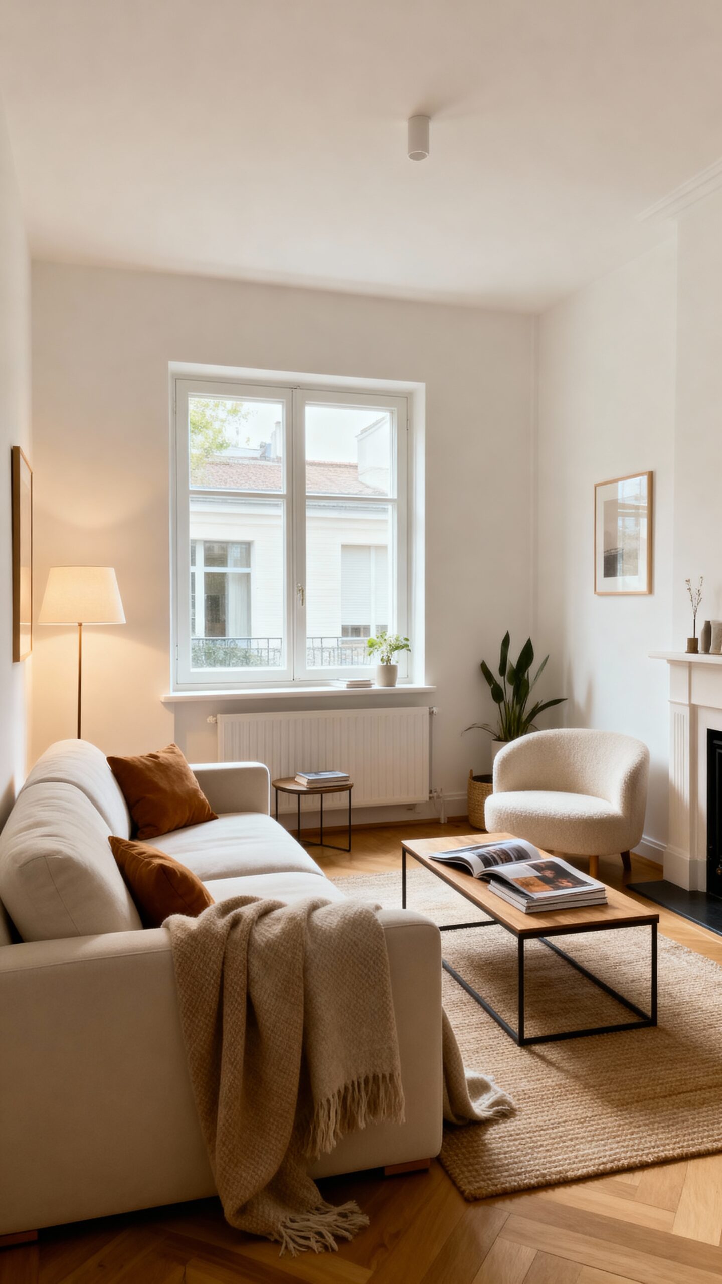
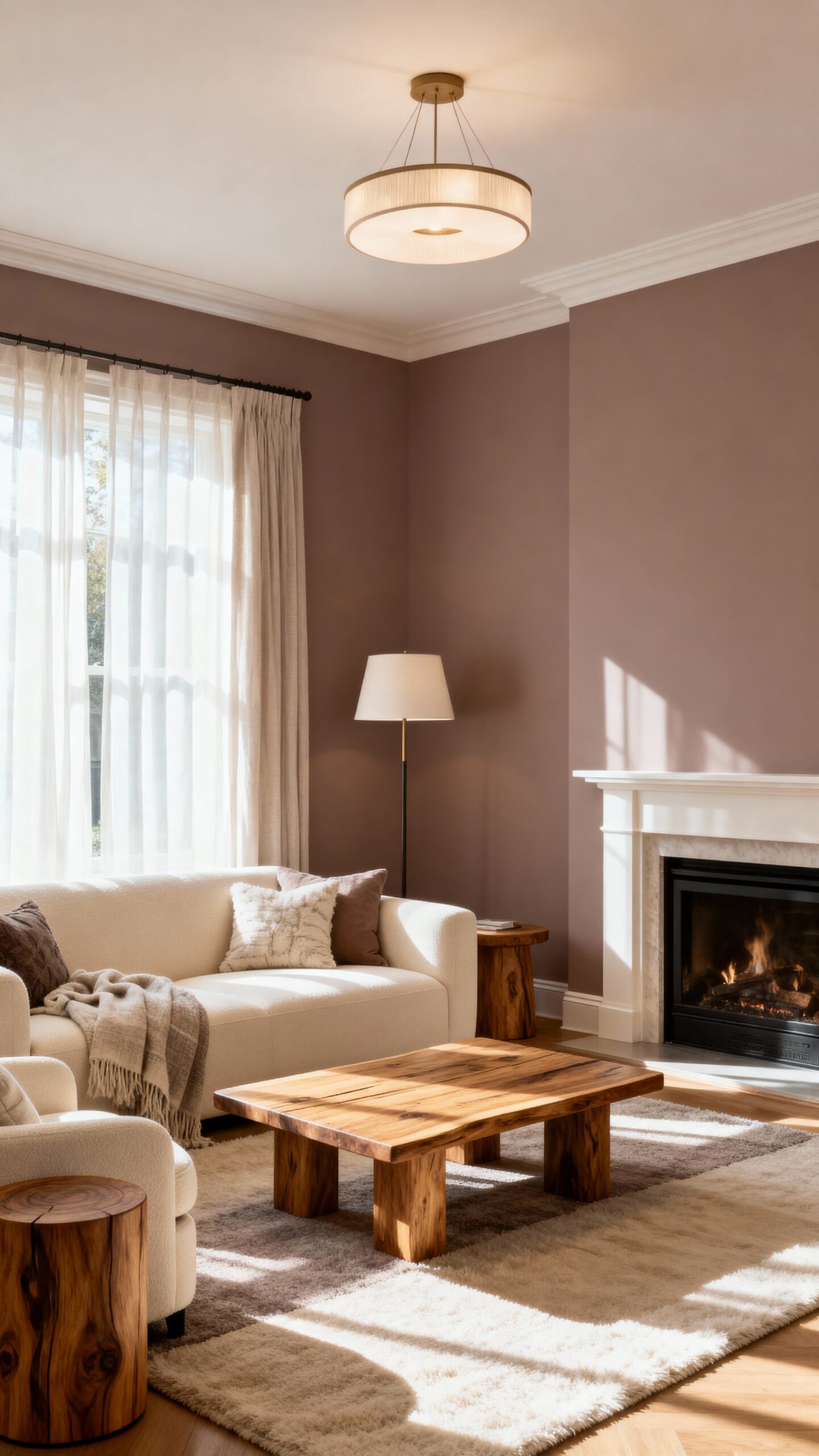
Warm Beige: Cozy Comfort That Still Feels Open
When you’re seeking a paint color that wraps your small living room in comfort without sacrificing visual spaciousness, warm beige delivers the perfect balance of coziness and openness. This versatile neutral creates an inviting atmosphere while reflecting light to maintain an airy feel throughout your space.
Choose beige shades with natural undertones like mushroom, oatmeal, or sand to add depth without overwhelming your room’s dimensions. These colors work exceptionally well with both cool and warm accent pieces, giving you complete freedom to change your décor seasonally.
Layer different textures through throw pillows, woven baskets, and linen curtains to create inviting texture against your beige backdrop. The neutral foundation allows designer details like crown molding or built-in shelving to shine while maintaining that essential sense of openness you need. Consider how your sofa selection will complement these warm beige walls, as the right furniture pieces can further enhance both comfort and the illusion of space.
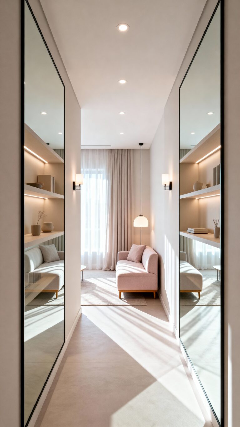
Dusty Pink: Unexpected Softness That Brightens
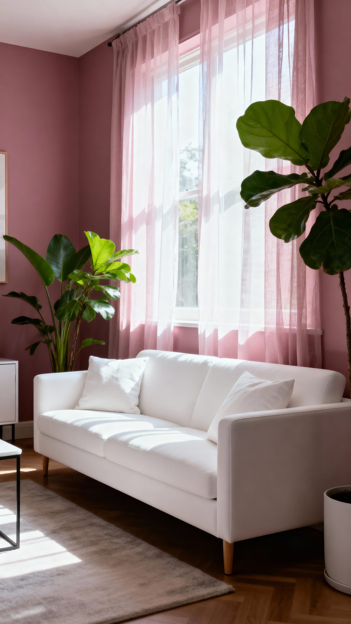
While warm beige offers timeless appeal, soft pink brings an unexpected twist that alters your small living room with gentle sophistication and astonishing light-enhancing properties.
You’ll uncover this muted rose shade creates a soothing ambiance without overwhelming your compact space. Unlike bold pinks, soft pink acts as a neutral that reflects natural light beautifully, making walls appear to recede and rooms feel larger.
This versatile color pairs effortlessly with white trim, brass accents, and natural wood furniture. You can complement it with sage green plants, cream textiles, or charcoal accessories for balanced contrast.
Consider painting one accent wall in soft pink while keeping remaining walls white, or use it throughout for subtle warmth. The result revamps your small living room into an inviting retreat that feels both contemporary and timelessly refined.
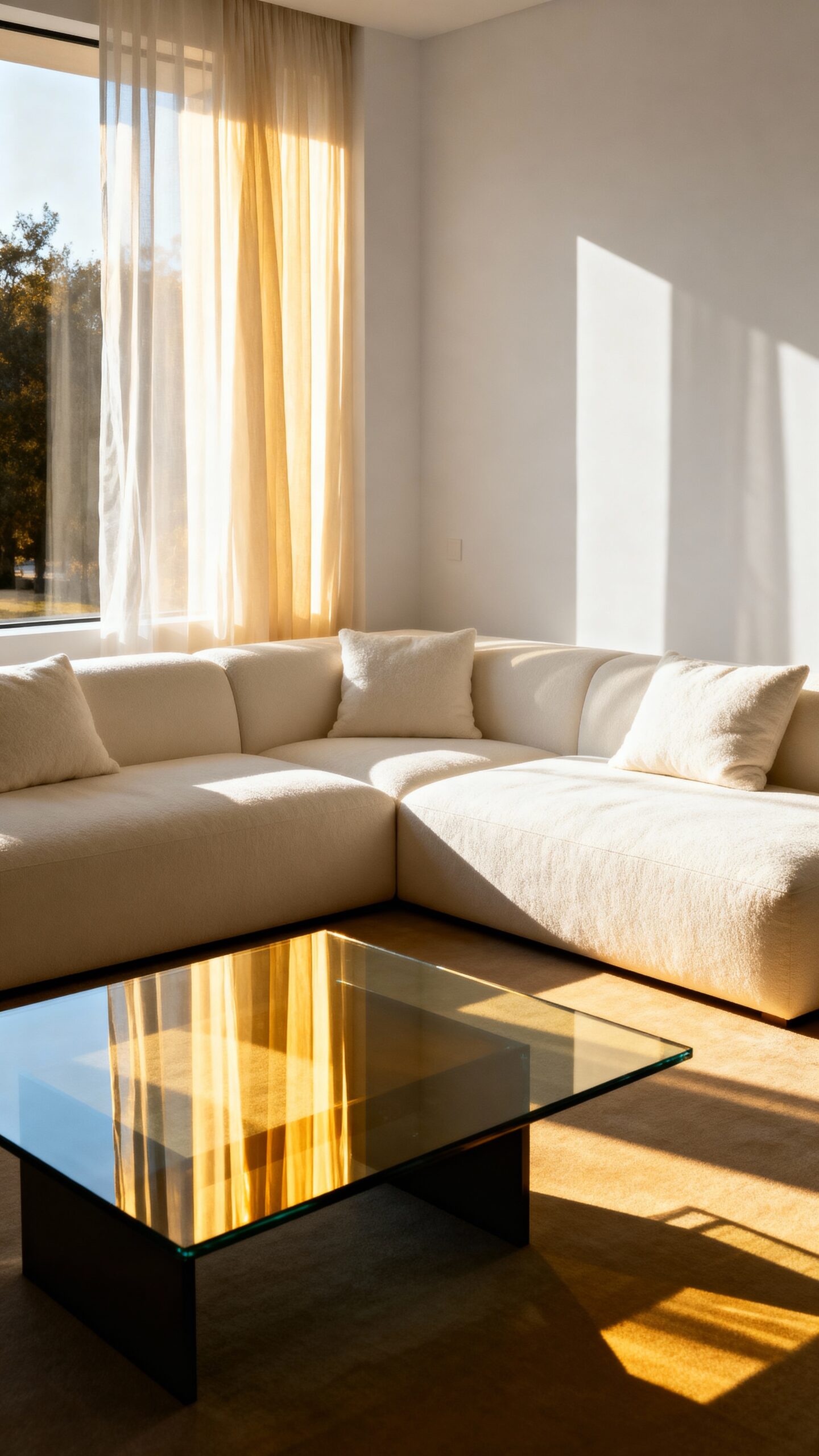
Champagne: Elegant Shimmer for Light Reflection
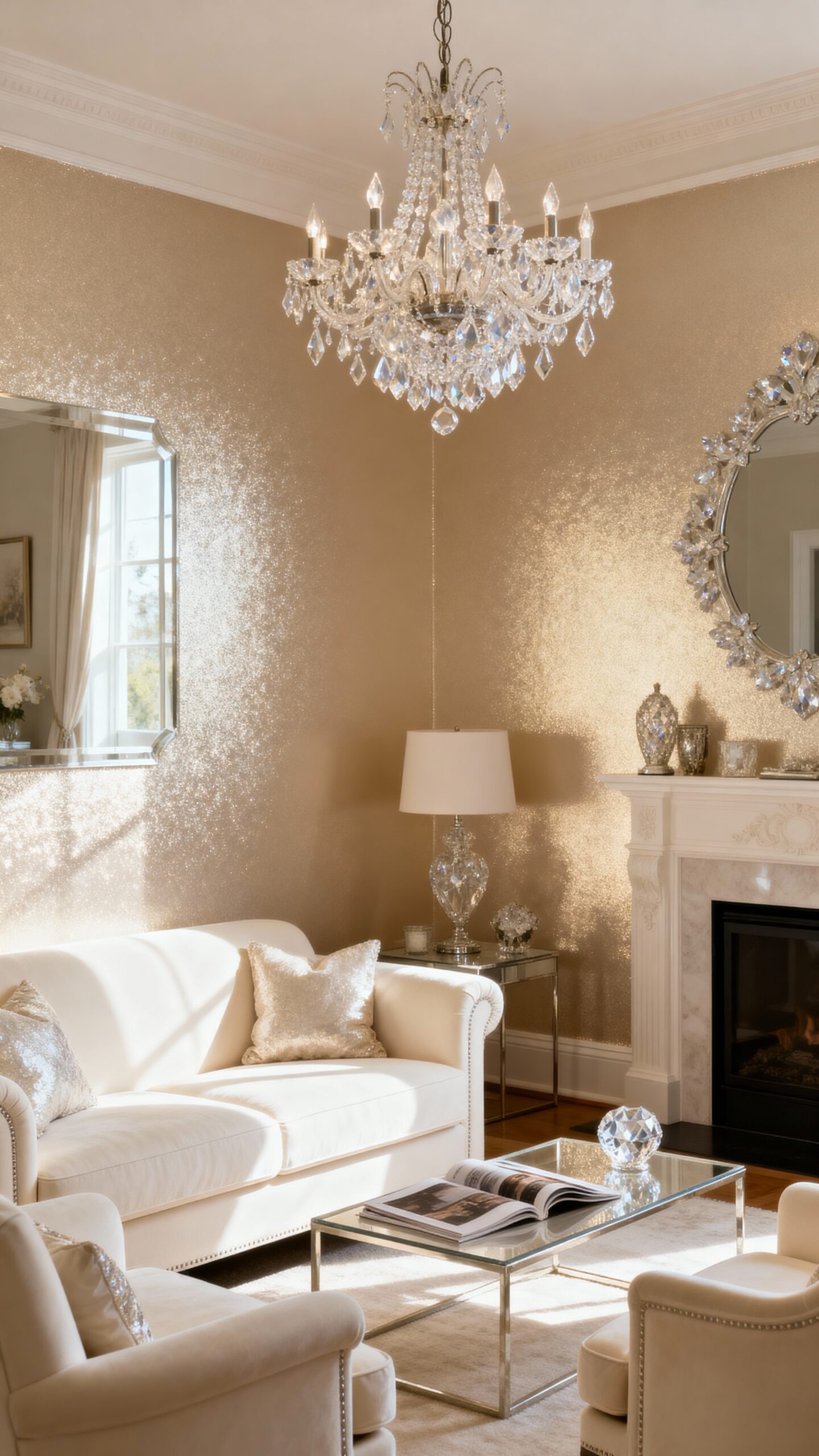
Champagne paint delivers sophisticated glamour that amplifies natural light through subtle metallic undertones, creating an illusion of expanded space in your compact living room. This warm neutral works exceptionally well because it reflects light while maintaining depth, preventing your walls from appearing flat or boring.
The soft shimmer in champagne paint catches daylight from windows and bounces it throughout your room, making corners appear brighter and more open. You’ll notice how this color changes beautifully throughout the day, appearing warmer in morning light and cooler in evening hours.
For maximum impact, pair champagne walls with white trim and light-colored furniture. The luminous reflection creates visual continuity that tricks the eye into perceiving greater square footage than you actually have.
Lavender Gray: Cool Tones That Create Distance
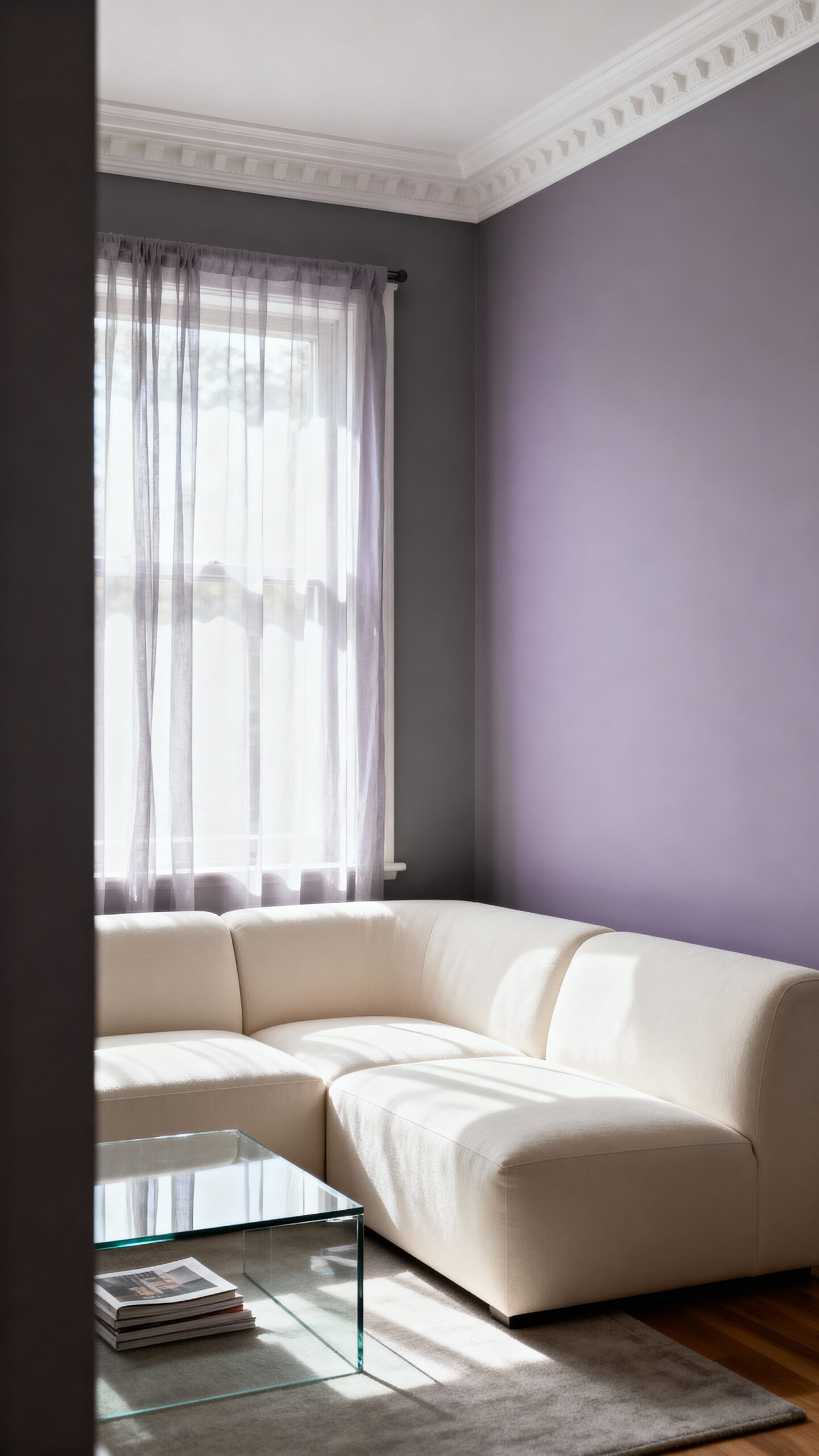
Lavender gray offers a completely different approach to expanding your small living room through its naturally receding cool undertones that push walls visually backward. You’ll uncover this sophisticated hue creates an airy atmosphere while maintaining elegance and depth in your space.
The muted undertones in lavender gray work exceptionally well with both warm and cool accent pieces. You can pair it with crisp whites for a fresh, modern look or combine it with deeper purples for dramatic sophistication. This versatile shade provides excellent color contrast opportunities when you add metallic accessories or natural wood elements.
Consider using lavender gray on your main walls while keeping trim and ceilings in bright white. You’ll maximize the visual expansion effect while creating a cohesive, calming environment that feels noticeably larger than its actual square footage.
Butter Yellow: Sunny Warmth That Energizes
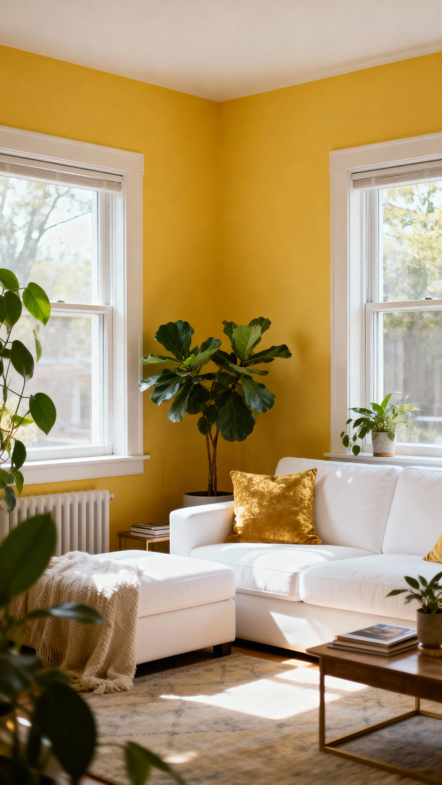
Unlike cooler tones that recede into the background, butter yellow brings an entirely different energy to your small living room by reflecting natural light and creating an instantly welcoming atmosphere. This warm hue modifies cramped quarters into spaces that feel both expansive and inviting.
You’ll uncover that butter yellow’s gentle warmth bounces light around your room, making walls appear farther apart than they actually are. The color generates a cozy ambiance without overwhelming your limited square footage, striking the perfect balance between intimate and airy.
Choose softer butter yellow shades rather than bold, saturated versions to maintain sophistication while maximizing space-opening benefits. Your brightened mood will be an added bonus as this cheerful color naturally lifts spirits and energizes daily activities in your compact living area.
Soft Mint: Fresh Appeal With Spacious Feel
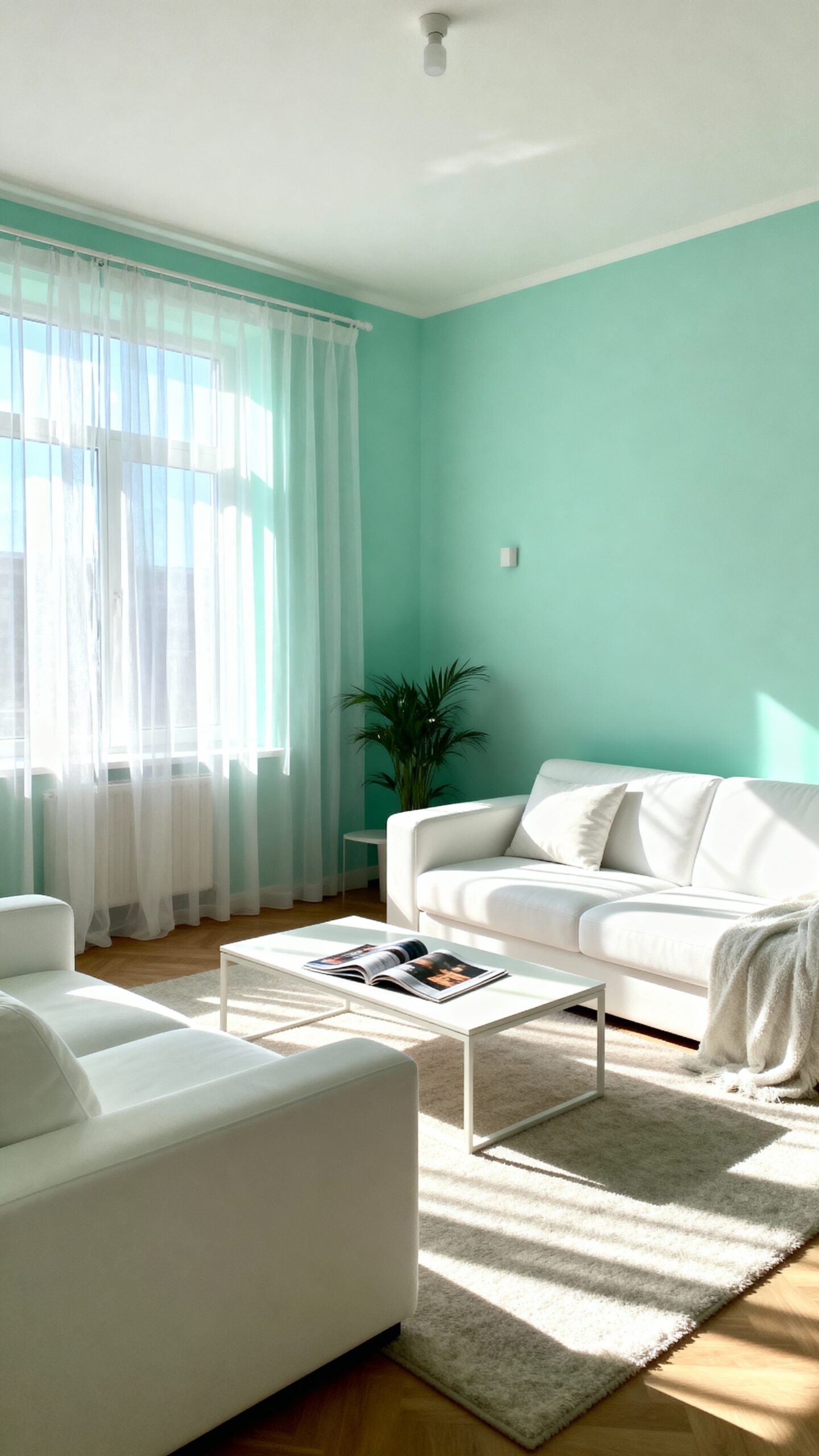
Moving from yellow’s energizing warmth, soft mint introduces a completely different approach that makes your small living room feel rejuvenatingly open and serene. This pale green hue creates an ethereal finish that visually expands your space while maintaining sophisticated charm.
You’ll uncover mint’s natural ability to reflect light beautifully, making cramped quarters appear larger and brighter. The color works exceptionally well with white trim and natural wood accents, creating depth without overwhelming your room’s proportions.
Consider pairing soft mint walls with cream furniture and brass fixtures for timeless elegance. This combination establishes a soothing atmosphere that encourages relaxation while keeping your space feeling fresh and uncluttered. The cool undertones prevent your room from feeling closed-in, giving you the breathing room you crave.
Mushroom Taupe: Earthy Depth Without Darkness
Three distinct advantages make mushroom taupe an exceptional choice for small living rooms seeking sophisticated warmth without sacrificing visual space. This versatile neutral creates a cozy ambiance while maintaining the room’s open feeling through its light-reflecting properties.
You’ll uncover mushroom taupe works beautifully with both warm and cool accent colors, allowing maximum decorating flexibility. Its earthy sophistication pairs perfectly with natural textures like jute rugs, wooden furniture, and linen upholstery.
Consider these application strategies:
- Paint all walls in mushroom taupe for seamless flow
- Use it as an accent wall behind your sofa
- Combine with crisp white trim for defined contrast
This grounding color eliminates harsh shadows that darker hues create, making your space feel larger while adding depth and character to your living room’s overall design.
Pearl Gray: Sophisticated Neutrality That Flows
When you’re searching for a paint color that effortlessly bridges warm and cool tones, pearl gray delivers the perfect balance of elegance and versatility for your small living room. This sophisticated neutral creates visual flow between spaces while maintaining the subtle variation that prevents your room from feeling sterile or cold.
Pearl gray’s timeless appeal lies in its chameleon-like quality—it adapts beautifully to changing light throughout the day. You’ll notice how morning sunlight brings out gentle warmth, while evening lighting reveals cooler undertones that create a calming atmosphere.
This shade pairs exceptionally well with crisp whites for trim work and complements both modern and traditional furnishings. You can layer pearl gray with soft blues, warm creams, or rich charcoals to create depth without overwhelming your compact space.
Conclusion
You’ll metamorphose your small living room into an airy, expansive retreat by selecting the right paint color from these thirteen options. Each shade offers unique benefits while maximizing your space’s visual potential. Consider your room’s natural light, existing furniture, and personal style preferences when making your final decision. Don’t hesitate to test sample colors on different walls before committing. Your newly painted space will feel remarkably larger and more inviting.