How to Mix Textures and Patterns for the Perfect Boho Look
Knowing which textures and patterns to combine can make or break your boho space—master this secret formula.
You’ll alter your space into a stunning bohemian retreat by commanding the delicate balance between textures and patterns. The key isn’t throwing together every colorful piece you love—it’s about creating intentional harmony through strategic layering and thoughtful placement. When you understand how to pair contrasting materials like smooth silk with rough jute, or blend geometric prints with flowing florals, you’ll uncover the secret formula that separates chaotic clutter from effortlessly chic boho design.
Understanding the Foundation: Color Palettes That Unite Different Elements
The secret to successfully mixing textures and patterns in boho design lies in selecting a cohesive color palette that acts as your visual anchor. Choose three to five colors that’ll appear throughout your space in varying proportions.
Warm earth tones like terracotta, sage green, and cream create natural harmony. You can experiment with complementary color combinations such as deep blues paired with burnt orange accents. Alternatively, monochromatic color schemes using different shades of the same hue provide sophisticated unity.
Start with one dominant color, add two supporting tones, then incorporate one accent color for visual interest and balanced contrast.
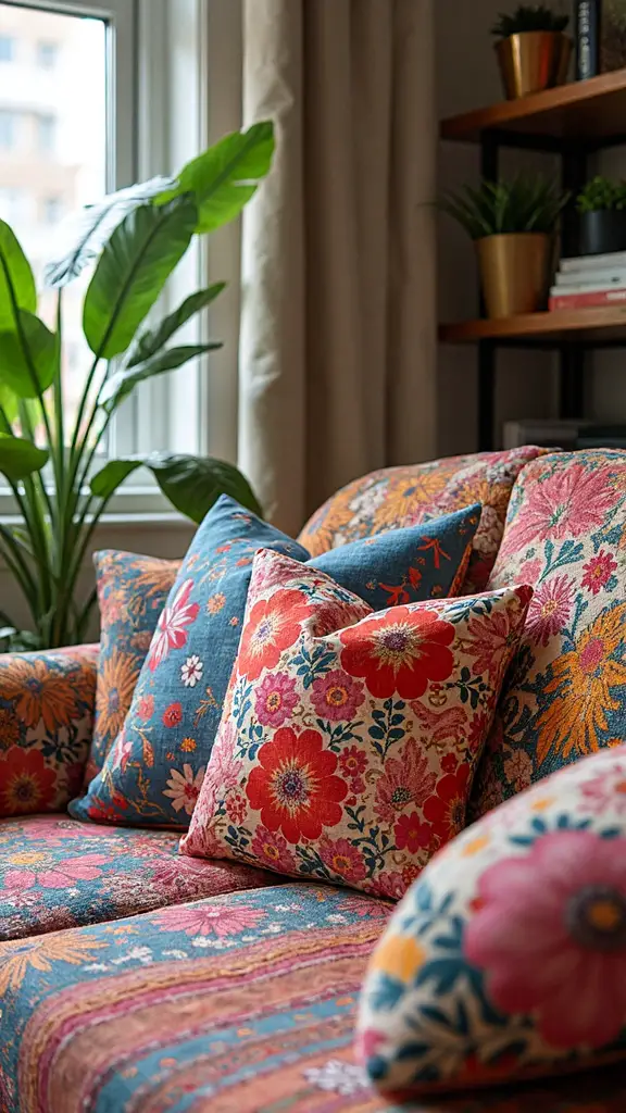
Layering Textures Like a Pro: From Rough to Smooth Surfaces
Successfully layering textures in boho design means balancing contrasting surfaces to create visual depth and tactile interest throughout your space. Start with a neutral foundation, then introduce contrasting fabric weights like chunky knit throws over smooth linen cushions.
Mix varying natural materials such as rough jute rugs beneath soft velvet seating or woven rattan alongside polished wood surfaces.
Focus on the 60-30-10 rule: sixty percent smooth textures, thirty percent medium textures, and ten percent rough elements. This creates harmony while preventing overwhelming visual chaos in your bohemian sanctuary.
The Art of Pattern Mixing: Scale, Rhythm, and Visual Balance
While textures provide the tactile foundation of your boho space, patterns serve as the visual storytelling elements that bring personality and movement to every room. Skillfully blend patterns by following three essential principles that’ll cultivate your space into a cohesive boho haven.
Start with contrasting patterns in different scales—pair large florals with small geometrics or bold stripes with delicate paisleys. Create visual rhythm by repeating similar colors across various patterns throughout the room. Balance busy designs with simpler ones, ensuring complementary scales work together rather than competing for attention in your beautifully curated bohemian sanctuary.
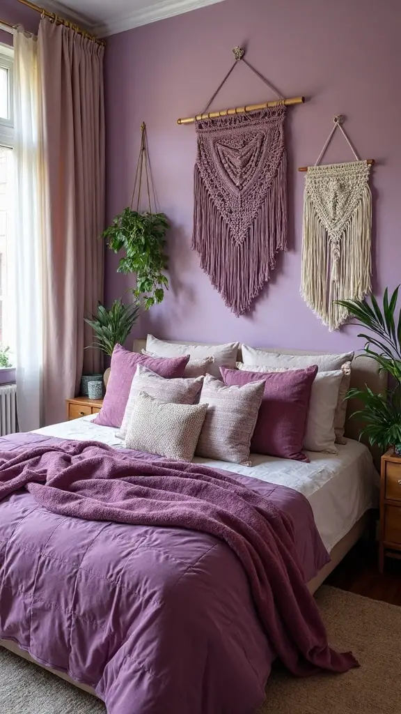
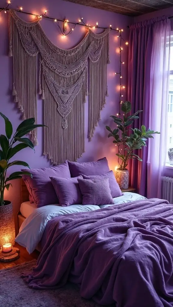
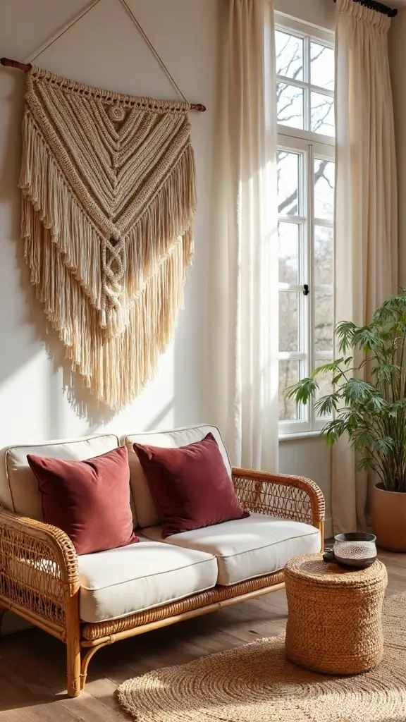
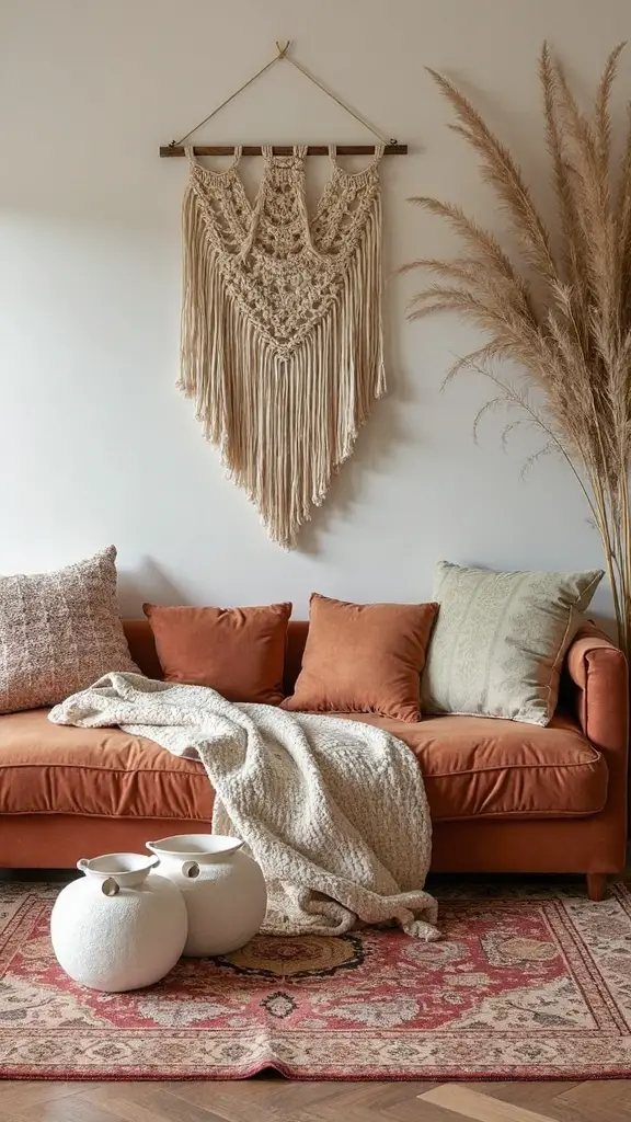
Essential Boho Textiles and Where to Place Them
Where should you position specific textiles to maximize their impact in your boho design scheme? Start with plush velvets on your sofa and accent chairs to create luxurious focal points that invite touch.
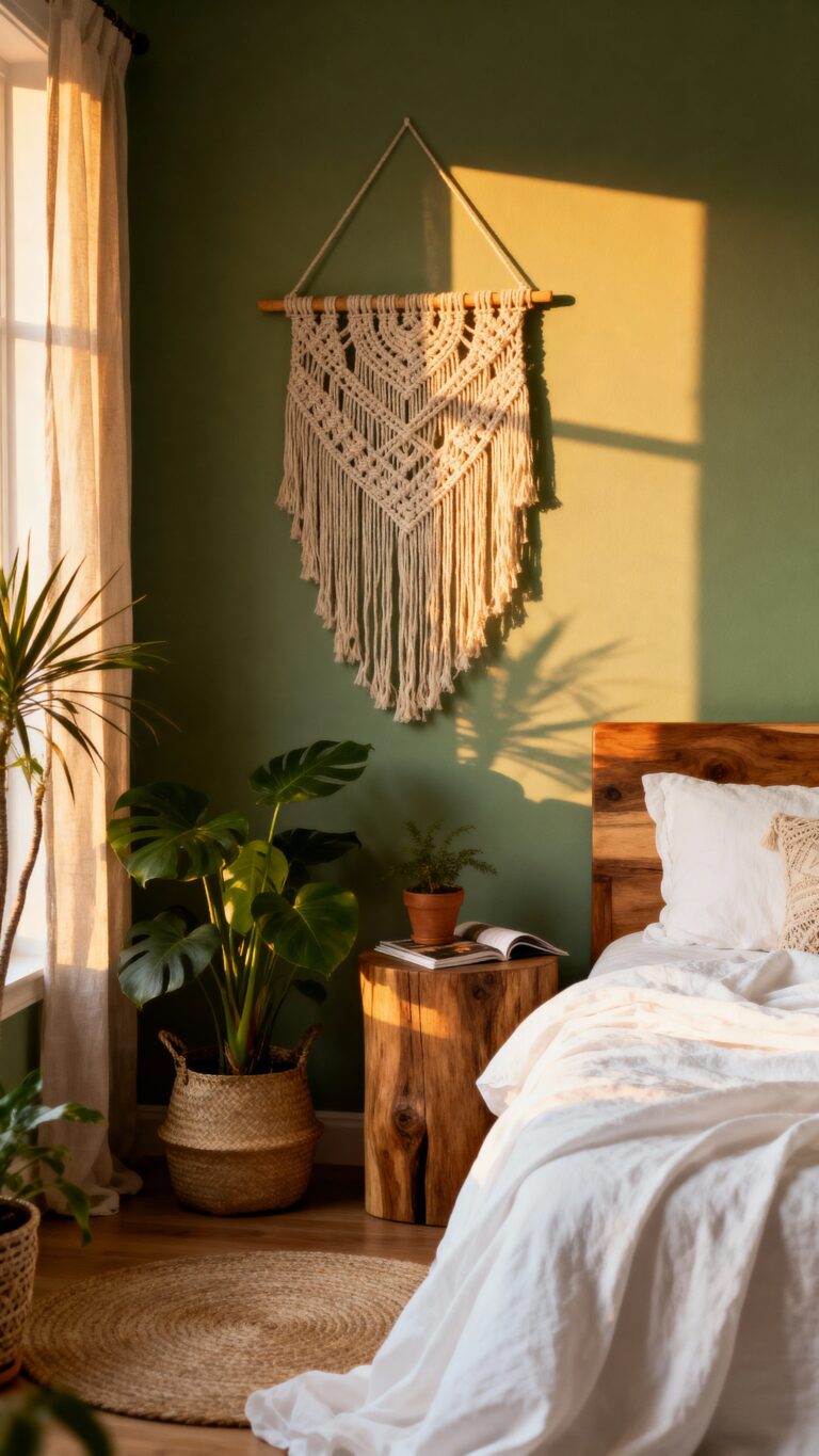
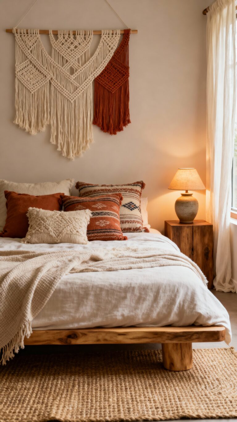
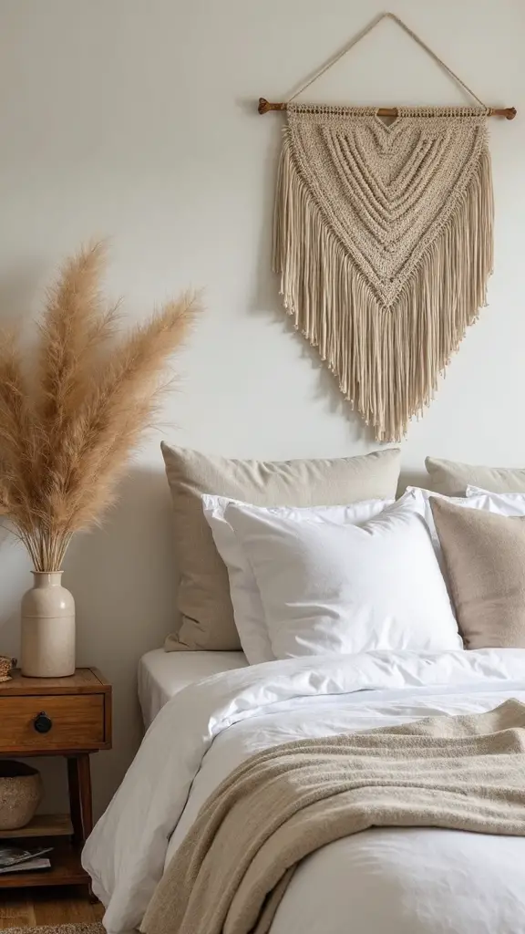
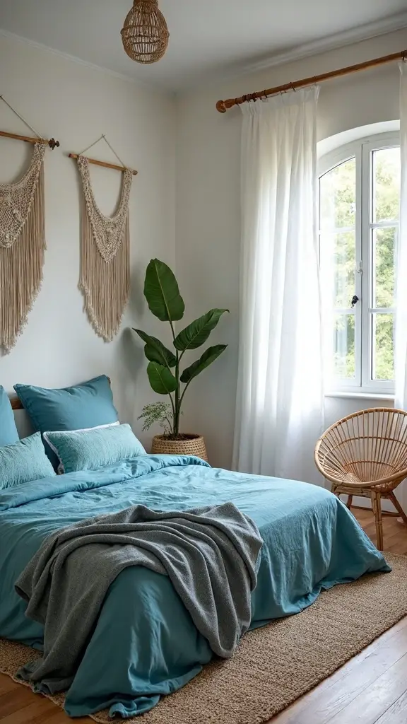
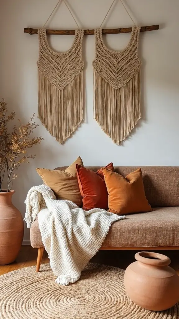
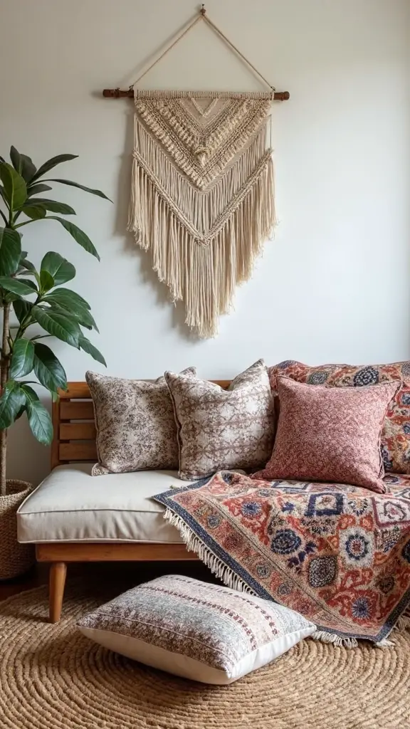
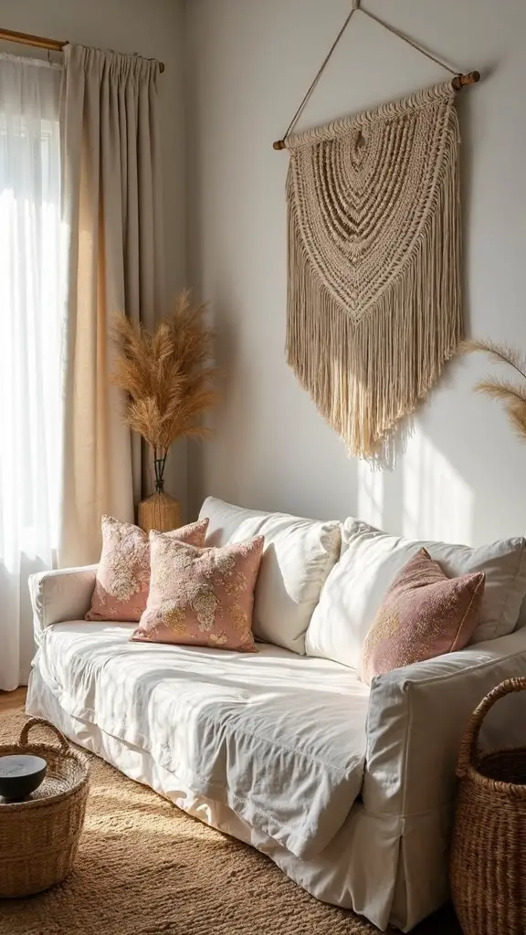
Layer textural weavings like jute rugs beneath coffee tables to ground your seating area with natural warmth. Hang macramé wall hangings above beds or sofas for vertical interest that draws the eye upward.
Place chunky knit throws over reading chairs to add cozy texture in quiet corners. Position embroidered cushions strategically across seating to distribute pattern while maintaining visual flow throughout your space.
Creating Focal Points Without Overwhelming Your Space
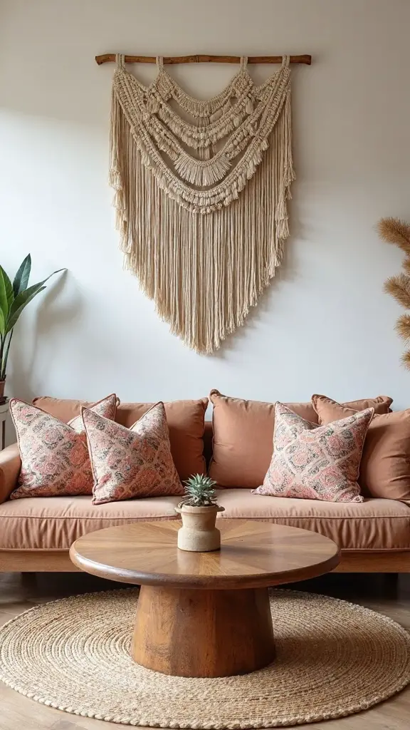
Three carefully chosen focal points can alter your boho space from chaotic to enthralling without creating visual overwhelm. Start by selecting one large statement piece—perhaps a macramé wall hanging or vintage Moroccan rug—as your primary anchor. Add two smaller complementary elements like textured throw pillows or patterned ceramics.
Balancing proportions becomes effortless when you follow the triangle rule: position focal points at different heights and distances throughout your room. This creates natural visual flow while highlighting statement pieces effectively.
Common Mistakes to Avoid When Building Your Bohemian Style
Why do so many beautiful boho spaces fall flat despite having all the right elements? The answer lies in common missteps that sabotage your design efforts.
Unbalanced color combinations create chaos instead of harmony. You’re mixing too many bold hues without considering undertones or creating a cohesive palette that flows throughout your space.
Excessive pattern variety overwhelms rather than delights. When you layer florals, geometrics, and tribal prints without restraint, your eye can’t find a resting place.
Focus on limiting yourself to three main colors and two dominant pattern styles to maintain visual balance.
Conclusion
You’ve now got the essential tools to create your perfect boho sanctuary through thoughtful texture and pattern mixing. Start with your neutral foundation, then gradually layer complementary elements while maintaining visual balance. Remember that successful bohemian design comes from patient experimentation and trusting your instincts. Don’t rush the process—your unique boho space will evolve naturally as you uncover which combinations speak to your personal style and create genuine comfort.